As I mentioned in a previous blog, “Don’t be Fooled by Color Tricks!“, color is all in our heads. Our brains receive “signals” from our eyes and then assigns colors to the objects under a wide range of lighting conditions. This process is called Color Constancy.
The amount of light reflected from an object constantly changes. Our brains identify the color of an object to be the same, even if there are changes in shade.

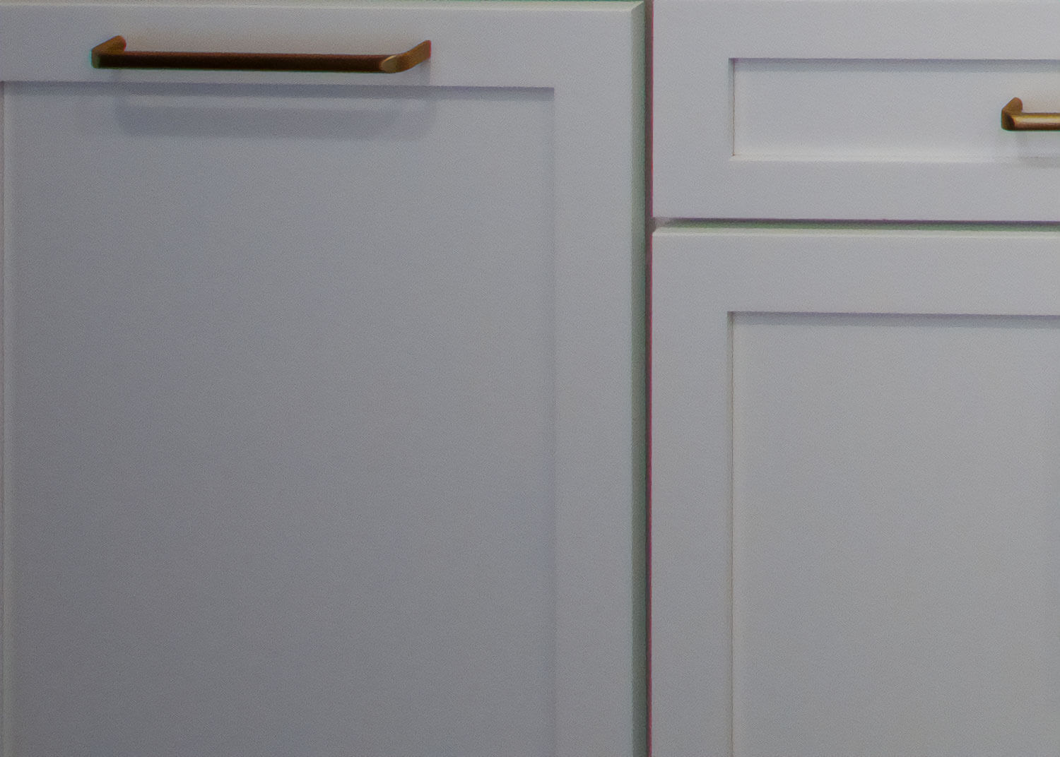
Although the lighting in the bathroom pictured below (left) is dimmed and moody, you still identify the cabinet color as a shade of white because your brain has taken in the clues of lighting and surroundings to calculate what the color would look like in full light. If you didn’t have the lighting clues from the picture on the left, you might perceive the cabinet color as a light gray hue, not a white like the close-up picture on the right.
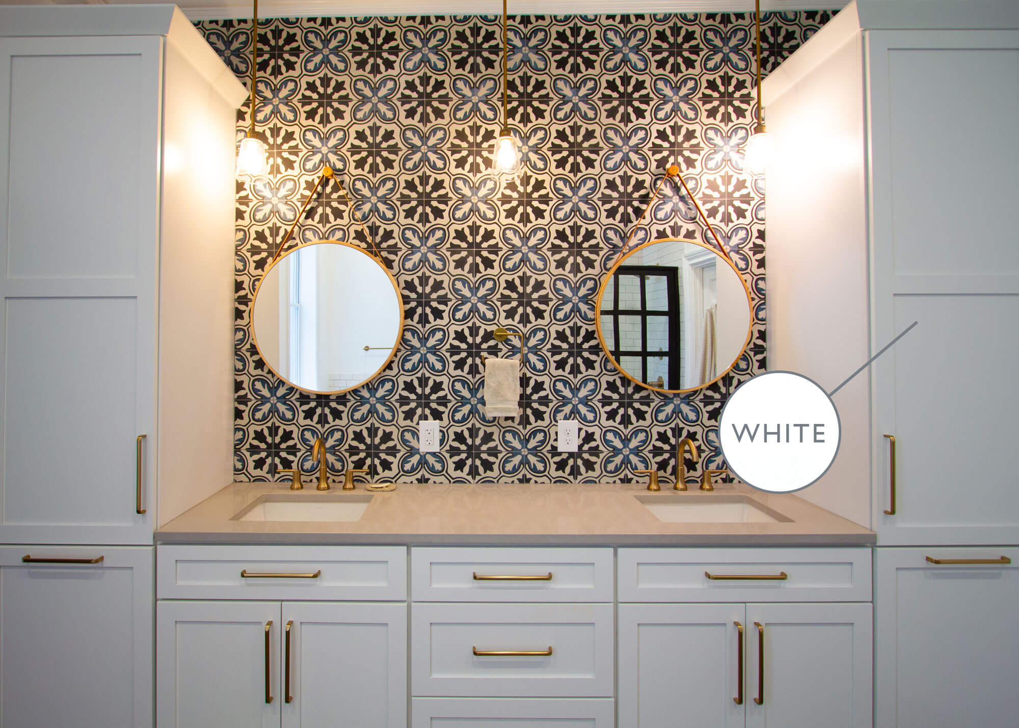
Can you tell with all the moody lighting that the cabinet is white?
Design by Devin Mearig of dRemodeling, Philadelphia, PA.
Does this look like gray or white to you?
Design by Devin Mearig of dRemodeling, Philadelphia, PA.
What does Color Constancy have to do with interior design?
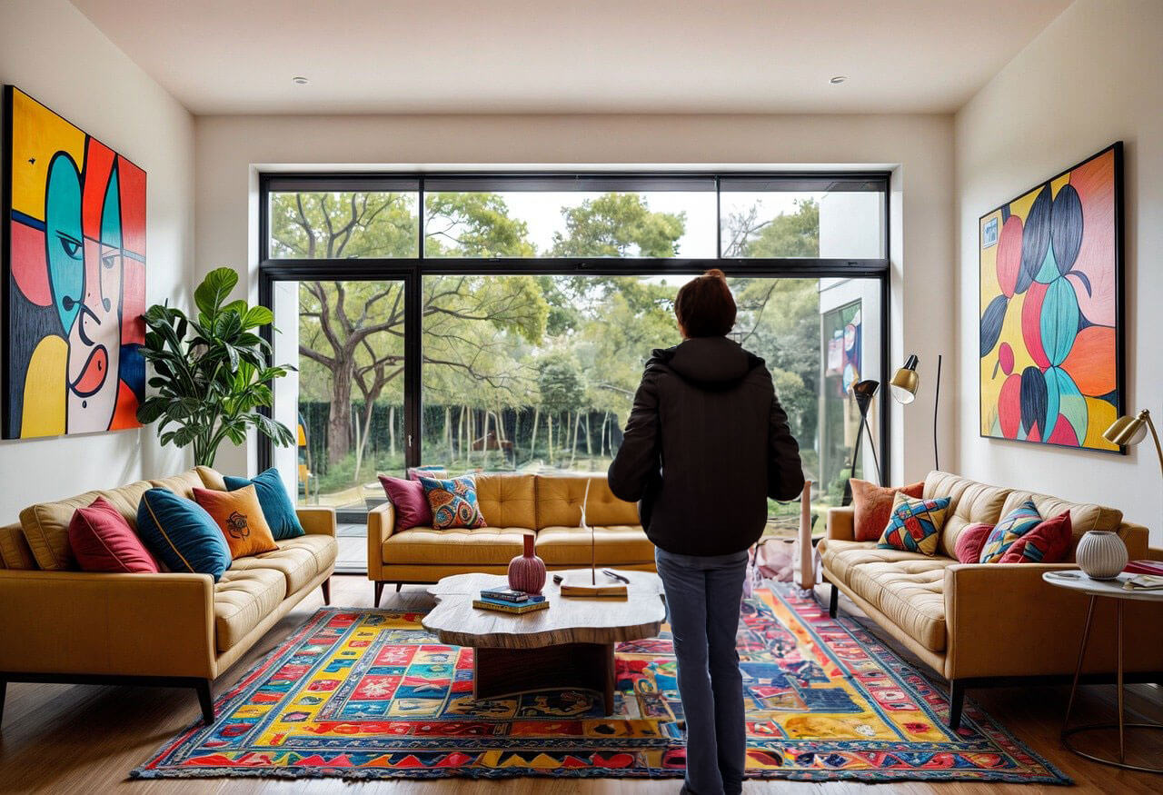
When we look for inspiration for our homes, we rely heavily on photos for ideas. Photography is only a snapshot of a room and can alter your ability to determine colors when you have no basis to ascertain the Color Constancy. If you are not physically standing in the room your brain doesn’t have the full amount of data to determine precise lighting accurately.
Our brain instantaneously uses clues from the image and fills in the missing information with its best judgment. Clues like shadows that tell your brain which direction the light is coming from, the time of day, the brightness of the space, and even the scale.
Missing too many clues, or getting a clue wrong is what causes Color Constancy Confusion.
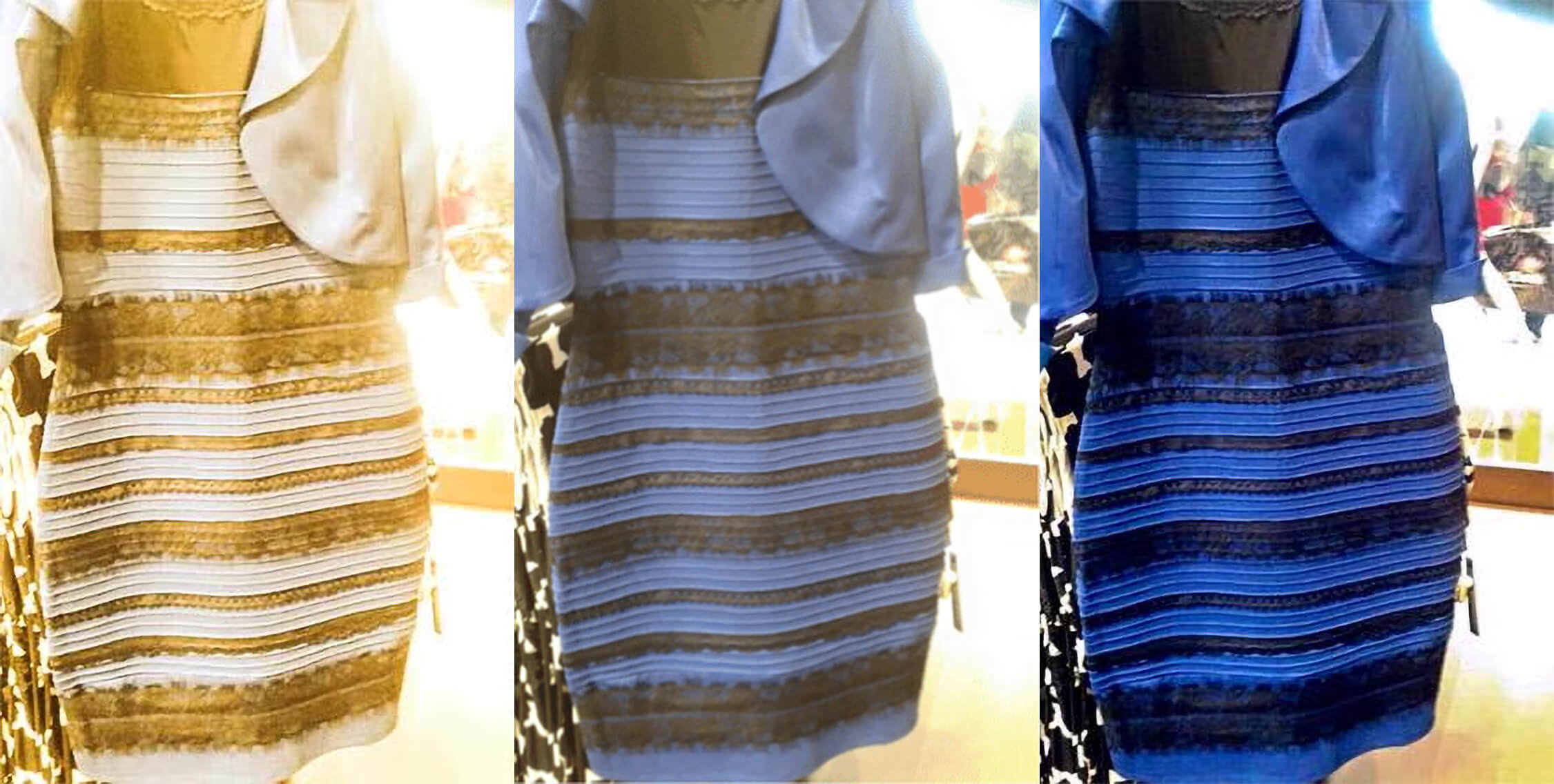
The original photo is of the dress is pictured in the middle. Half of the people who view it will see it like a darker version of a white and gold dress (like the color altered photo on the left) the other half will see the dress as a bright version of the blue and black dress (like the color altered photo to the right). Which dress do you see in the middle?
A perfect example is the famous “Gold Dress/ Blue Dress” debate that went viral as everyone debated what color the dress was. Some of us see a white and gold dress while others see a blue and black dress. This is because the photo doesn’t give enough clues about the lighting in the room. Is the dress in a shadow with a bright background? Or is the whole room bright and washed out?
This phenomenon happens more often than you’d think when visualizing a space through a screen or photo. Maybe not as dramatically as the Gold Dress/Blue Dress situation. But say you purchased a bathroom countertop based on an image online. You don’t want to think you are getting a green-gray and end up getting a blue-gray countertop, or maybe get a color that is darker or lighter than what you had hoped for. That could be very disappointing.
If you are not physically in the space and able to use all of your senses to give you the clues needed to understand a specific color, you run the risk of encountering this color trick. When you’re looking at an image it is more likely to have missing information that your brain fills in for you automatically.
How Do I Avoid Color Confusion When I Shop For Products for My Home?
When making a large investment like a kitchen remodel you don’t want to be surprised by “Blue Dress” finishes when you’re expecting “Gold Dress” finishes. Before choosing any of your interior finishes, take a sample of the cabinet door, paint, countertop, flooring, etc., and view it in the room you plan to remodel. Sometimes, even the shadows of a cabinet door can make a very different impact under different lighting sources. Making sure the colors look the way you want them to in the actual setting can give you confidence that you’re picking the right colors for your space.
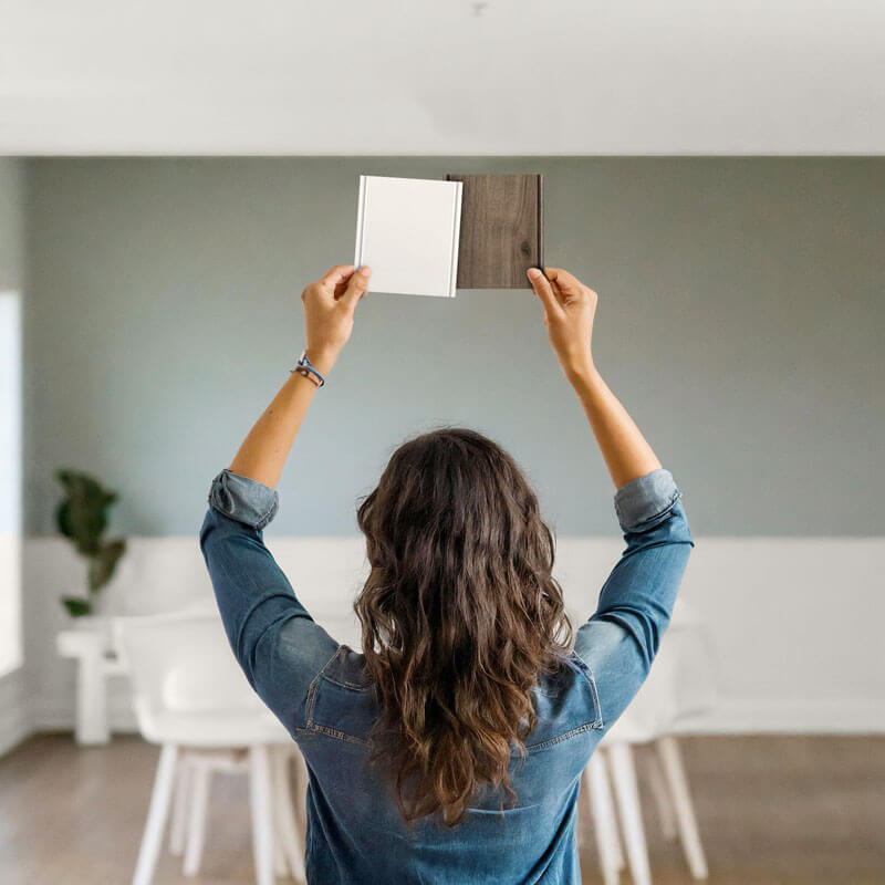
To avoid making a Color Confusion mistake, don’t make your final kitchen selections ONLY from the appearance in a brochure, magazine, or online photo. Try to view the products in person and if you have the option while standing in the room you plan to remodel. Fully read product descriptions to understand the size, color, and materials used.
Usually, most manufacturers that offer products like cabinets, paints, carpets, countertops, tiles, etc. offer samples you can borrow, keep, or purchase to bring home for just this purpose. Products like appliances may be difficult to view in your home before purchasing, but I still recommend viewing them in person and alongside your other finish pairings before making your final selection.
You’re Not Alone
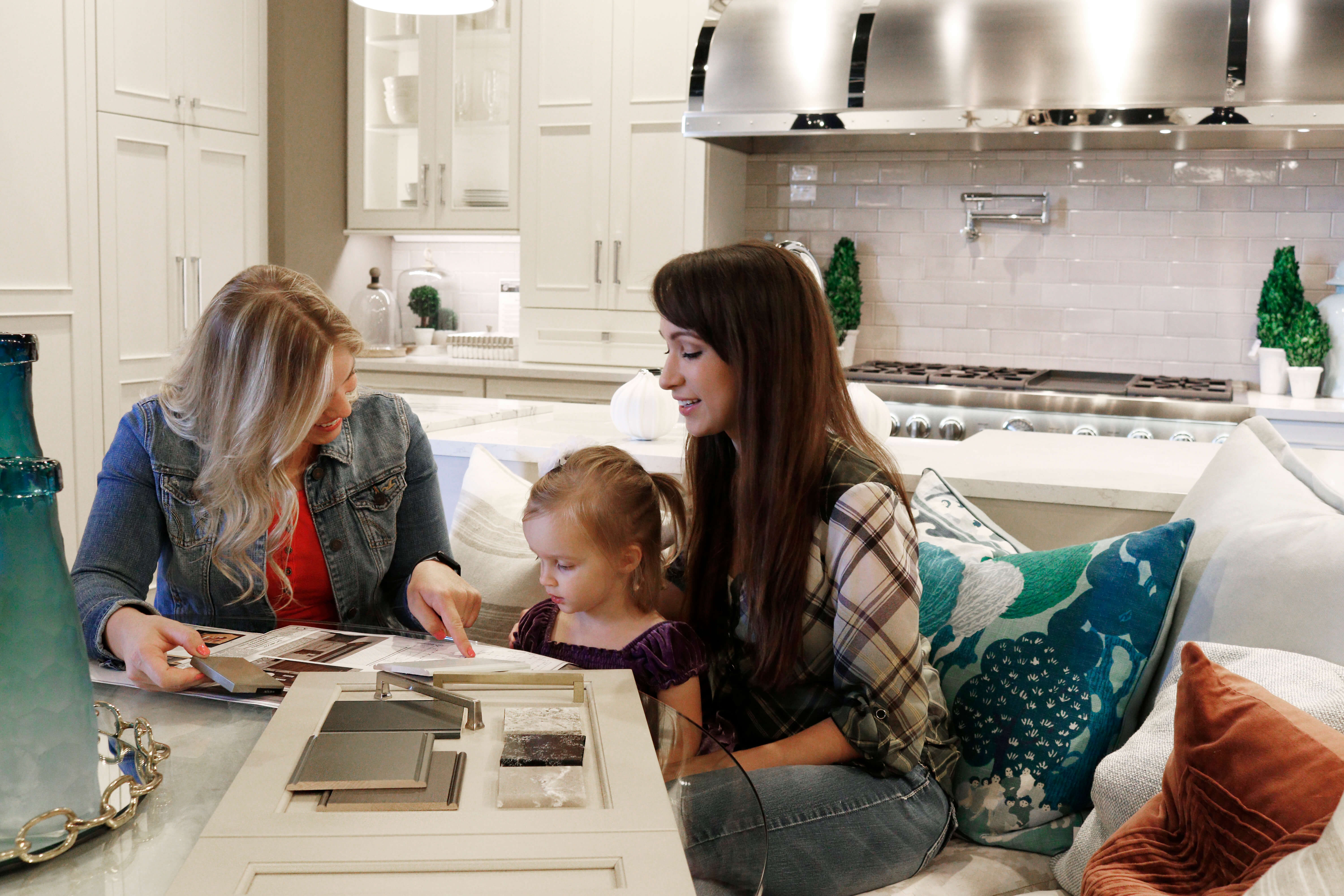
Don’t worry, you’re not in this alone, your professional kitchen & bath designer can help you with all of your color & finish selection questions. If you have questions about the colors for your interior design, stop by your local Dura Supreme Showroom to start the conversation with one of our knowledgeable designers.
Learn more about best practices for selecting colors for your home from our Making Selections Guide.
This blog is part 4 of a 4-part blog series. Check out the other blogs in this series about color tricks: