A 1870s townhouse located within the historic district of Washington, DC, belonged to a set of homeowners who loved the charm of DC, had a passion for cooking and enjoyed entertaining for their friends and family. The only downside of their charming DC townhouse was that their current kitchen, centered in the middle of the house, was not functioning for their culinary and entertaining needs.
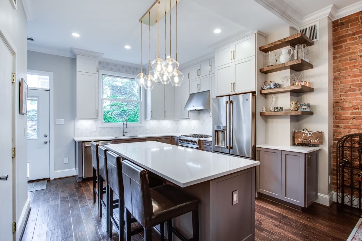
When it came time to initiate their plans to remodel their kitchen, both the homeowners knew exactly what they wanted for their new kitchen. They wanted to open up a wall and relocate their kitchen from the center of their townhouse to the back of the house. Other requirements that were a must for their new kitchen was that it should incorporate a nice range for culinary cooking, have good ventilation and that the kitchen workspaces should be efficient and functional for a passionate cook.
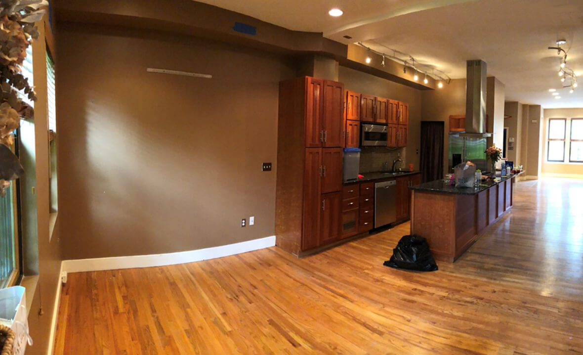
The existing kitchen was located in the center of the townhouse and was not functioning properly for the homeowners who loved to cook and entertain.
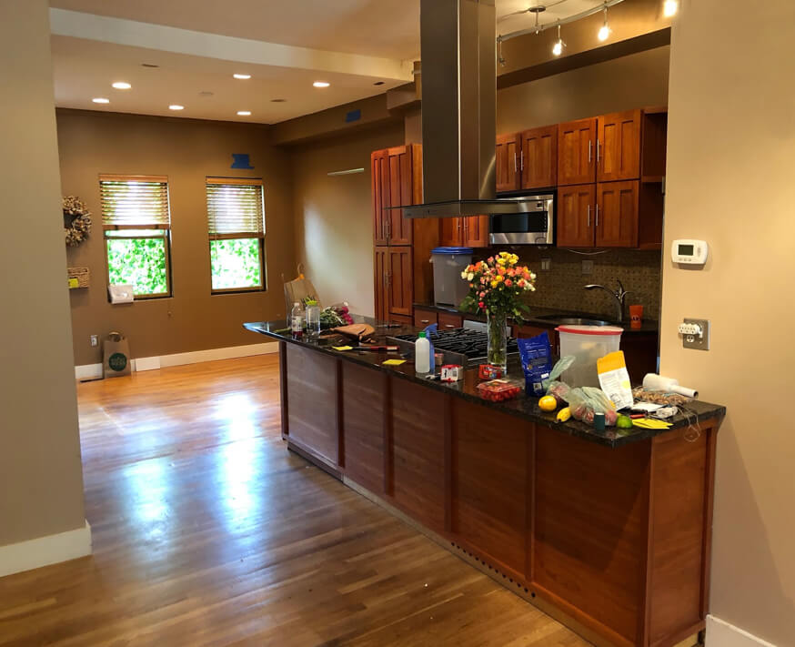
One of the challenges for the kitchen remodel was the townhouse was located in NW Washington DC, Logan Circle, a classified historic district of DC. This meant that there would be restrictions to the remodeling project in order to ensure that the original characteristics of the home and its neighborhood would be preserved and protected.
In order to achieve their dream kitchen goals, the homeowners contacted and hired Bath Plus Kitchen to assist them with their project.
“From the start, we knew the kitchen was being relocated”, stated Bath Plus Kitchen. Based on the layout of the back of the townhouse, it was natural to design an L-shaped kitchen with an island, but “we had to make sure that it was feasible from a trade standpoint. It took adding a sub panel on the first floor and running lots of plumbing and electrical.”
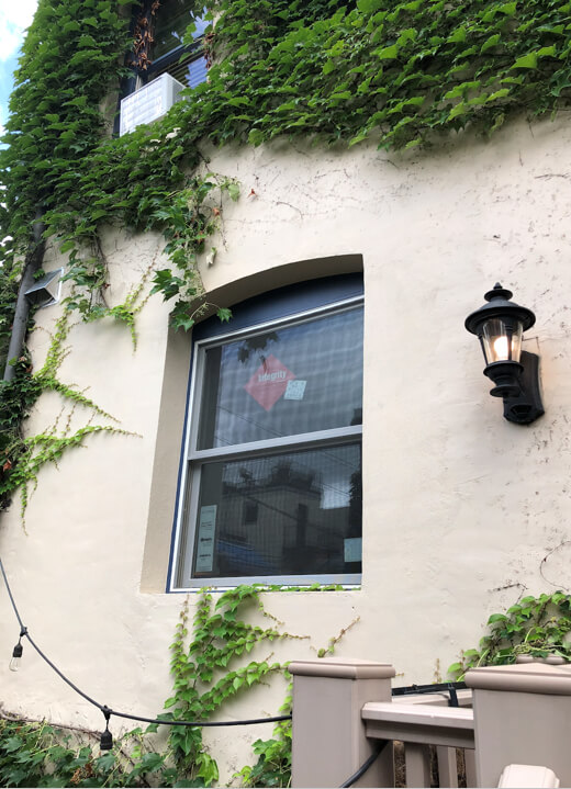
Also, since the townhouse was a historic home, “we had to contact the Office of Planning – Historic Preservation to make sure we could convert two windows into one since the back of the house is not visible from the alley we were approved. To make up for losing two windows we did one larger 46” x 55 ½” high window” explained Bath Plus Kitchen.
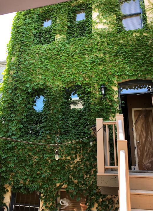
This is a before photo of the two small exterior windows that were converted into one large window for the homeowner’s new kitchen.
The single larger window after the remodel.
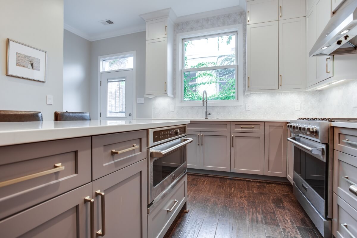
This image showcases the new single-window that replaced the two smaller windows in the original design.
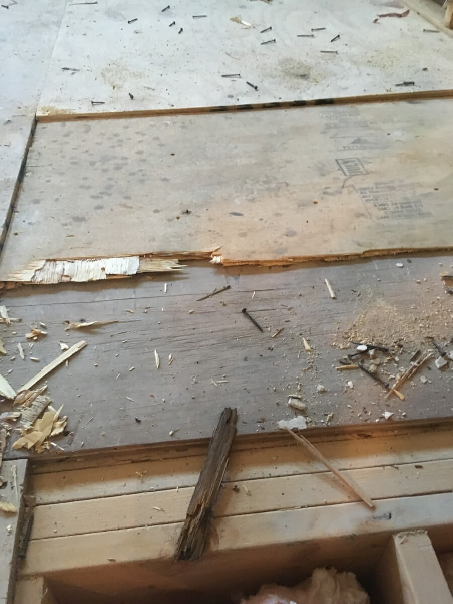
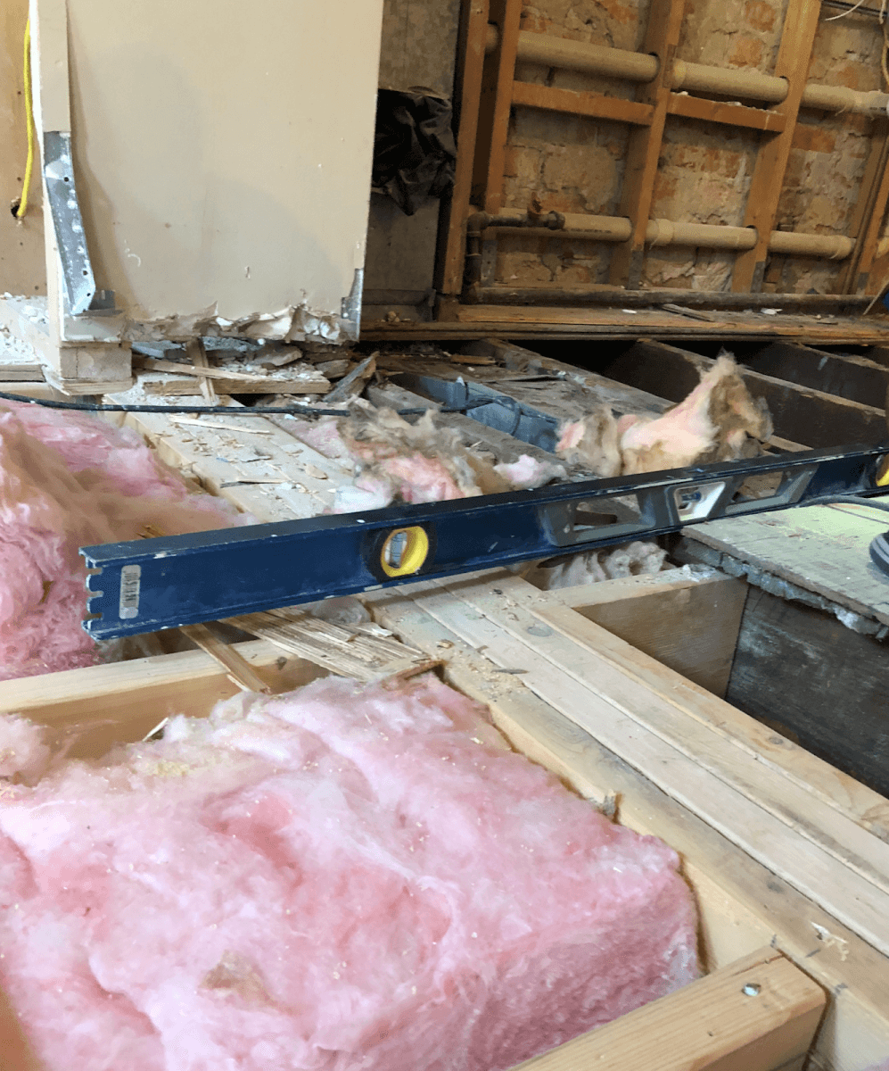
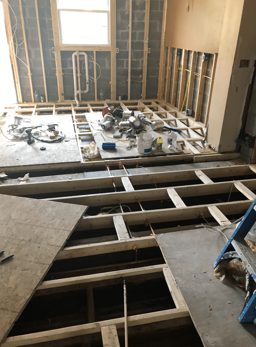
Those weren’t the only challenges that presented themselves during the project. During the demolition phase, it was discovered that the addition where the existing kitchen was located was poorly built within the last twenty years. “The contractor who built the addition somehow built it a few inches too short of the house. To make up for it, he installed four layers of subflooring, which made the floor slope from where it joined the house to the new back of the house”, expressed Bath Plus Kitchen. They also discovered that the original subfloor was not in the best of shape either. These construction challenges were corrected by Bath Plus Kitchen’s professionals sistering all the floor joists and installing a new subfloor for the entire first floor of the townhouse and setting the perfect foundation for the gorgeous wide plank brown saddle floors and Dura Supreme Cabinetry.
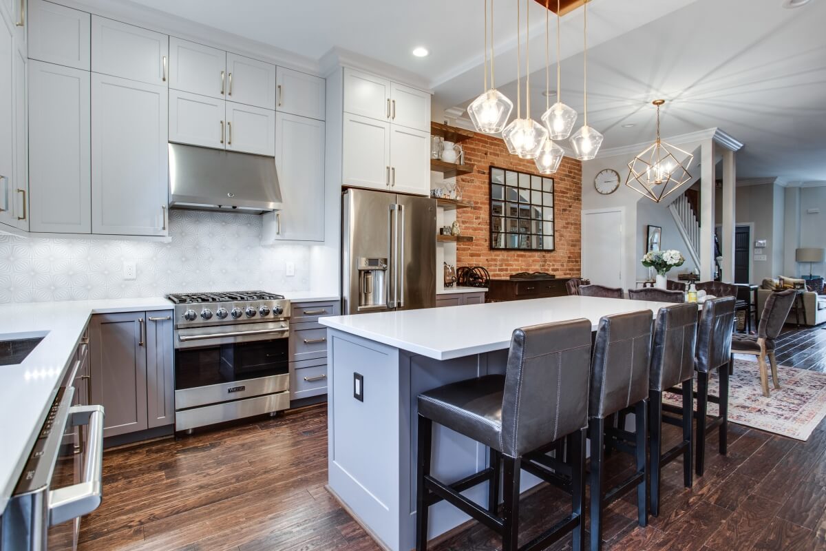
Aesthetically, the designers pulled inspiration from the client’s desire to eliminate the beige, dark tones, and brighten the kitchen space with light colors. The star and keystone of the kitchen design was the Fireclay Tile starfish patterned backsplash. Its pattern and color set the stage for the two-toned cabinetry, featuring Dura Supreme’s painted white finish for the upper wall cabinets and matching the purple-gray lines in the tile with a custom color in Sherwin Williams Sensuous Gray for the base cabinets. Other design elements incorporated into the design were the Oak open shelving in Dura Supreme Cabinetry’s Praline stain, mixed metals with satin brass hardware, lighting, and stainless-steel appliances, kitchen sink and faucet.
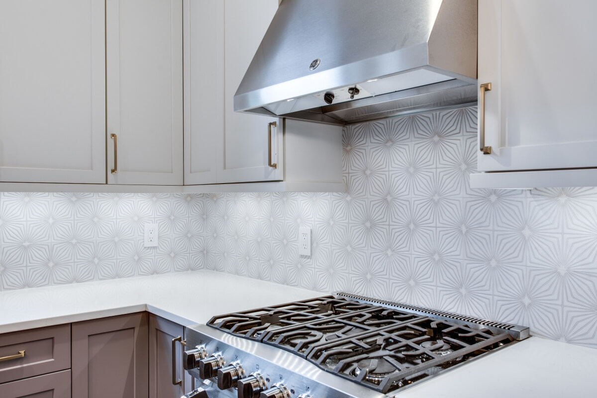
The purple-gray lines in the starfish pattered Fireclay Tile ties the two-toned cabinetry together beautifully.
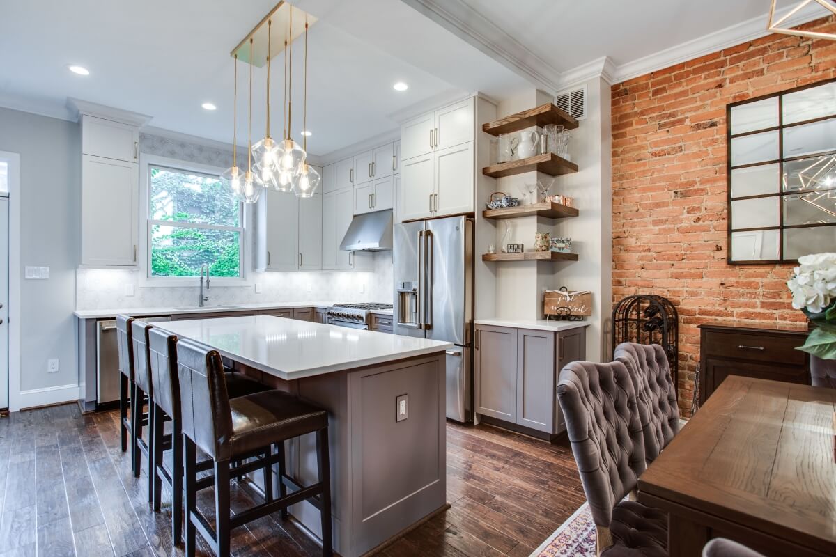
A bonus surprise was the exposed brick wall. After removing the drywall during the demo, “we were fortunate to find the brick mostly intact and in great shape behind the now dining room wall. Exposing the brick made it feel more DC and the clients loved it”, expressed the designers.
Another surprise that the designers and homeowners encountered during the remodeling process was that the wall under the stairs that they removed was load bearing. Two load-bearing posts had to remain but the designers were clever and made great use out of the space by creating a dry bar. “We ordered the Dura Supreme Cabinetry and wood top for a countertop. It’s all in the same color as the wall paint. The cabinets integrate beautifully into the space and it also provides great functionality out of what would otherwise have been an awkward area.”
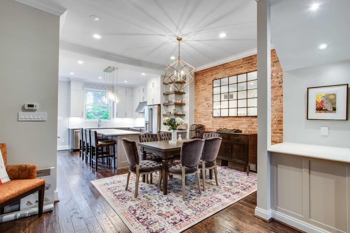
A dry bar was cleverly designed in between two load-bearing posts under a stairway.
Overall, despite the many challenges the project presented, the end result turned out superbly. “It completely transformed the first flooring of the home and opened it up for entertaining”, said Bath Plus Kitchen. The Bath Plus Kitchen team loves it and the homeowners are very happy with the kitchen. One could say the kitchen has become a culinary hotspot and will be getting plenty of use from its passionate cooks.
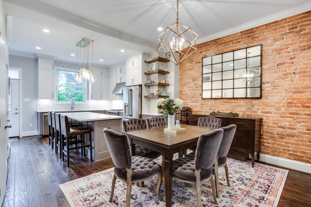
The Bath Plus Kitchen designers made use of the bump-out to the right of the fridge by customizing base cabinetry and open shelving from Dura Supreme Cabinetry.
