Surfaces— The finish matters. The species matters. The style matters. We have seen surfaces extended over the sides of cabinetry in waterfall countertops, the exploding trend of either tiling or putting a solid surface over an entire bathroom wall, where before we may have seen only a backsplash or wainscot tile.
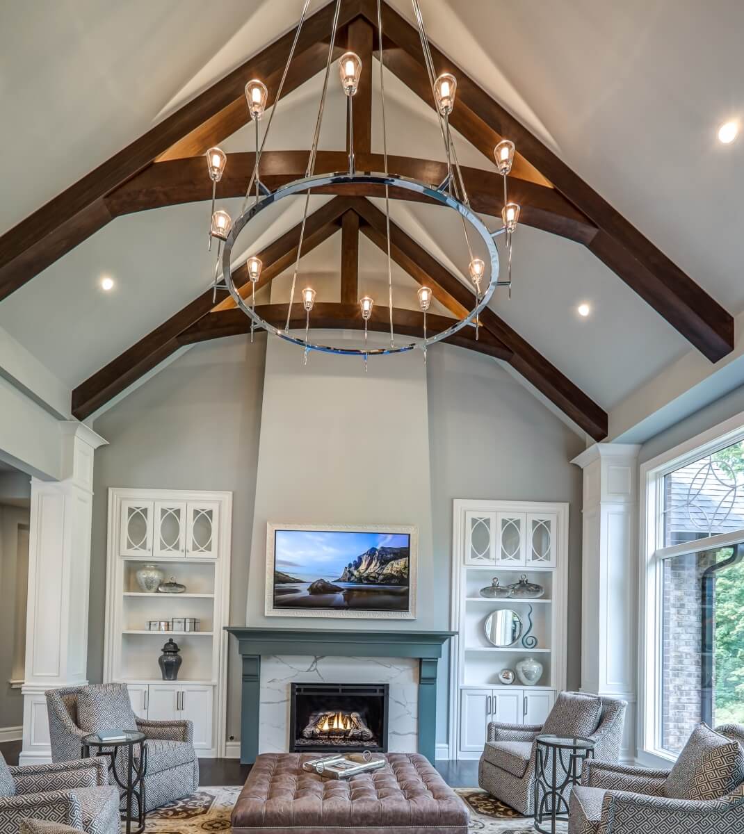
With all of this in mind, I am here to talk about the surface of the 5th wall, the ceiling. This piece of the design has grown in importance lately. It’s not that it wasn’t considered before, it was, but generally was incorporated into bigger dollar designs. Today, it is being considered more mainstream to have a ceiling design plan, and with good reason. It can really elevate a design to the next level and help to define a space- from a style and function perspective.
It can bring tall ceilings to a human scale and provide a functional spot for lighting.
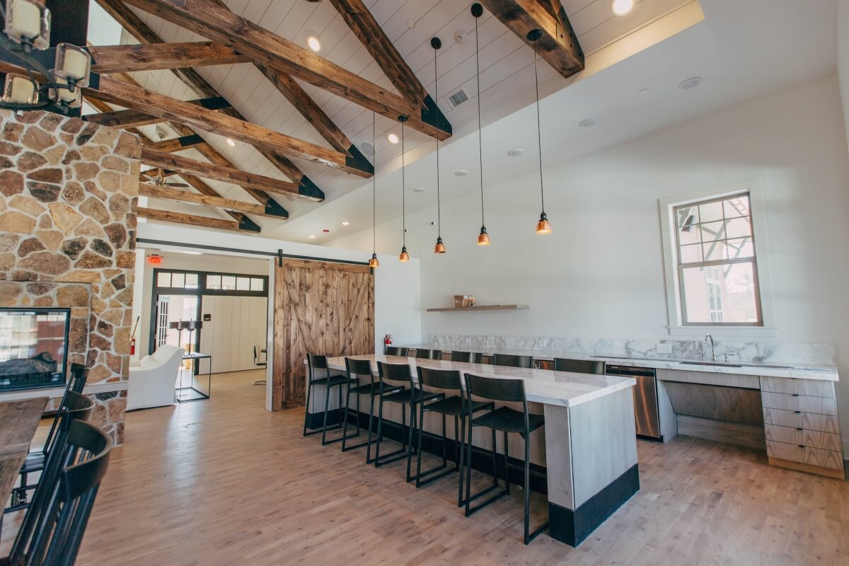
Rough-hewn trusses and shiplap ceiling with lighting, Photography by Michael Browning.
Rustic wood beams or trusses can bring texture into a space.
Below we see beams helping to define a hearth room on one end of an open concept floor plan.
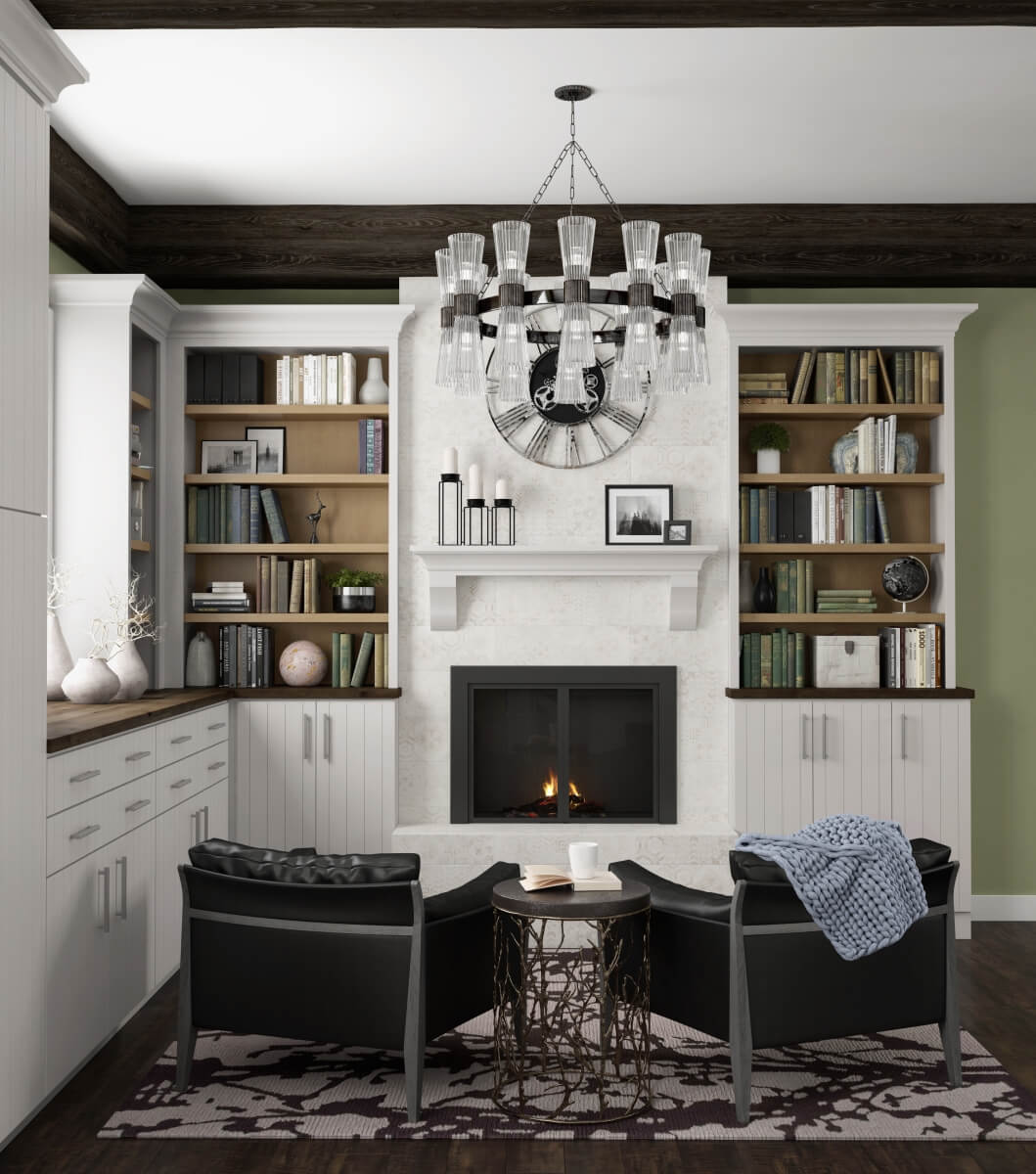
Dark wood ceiling beams around the perimeter of this hearth room define the space, all Dura Supreme Cabinetry.
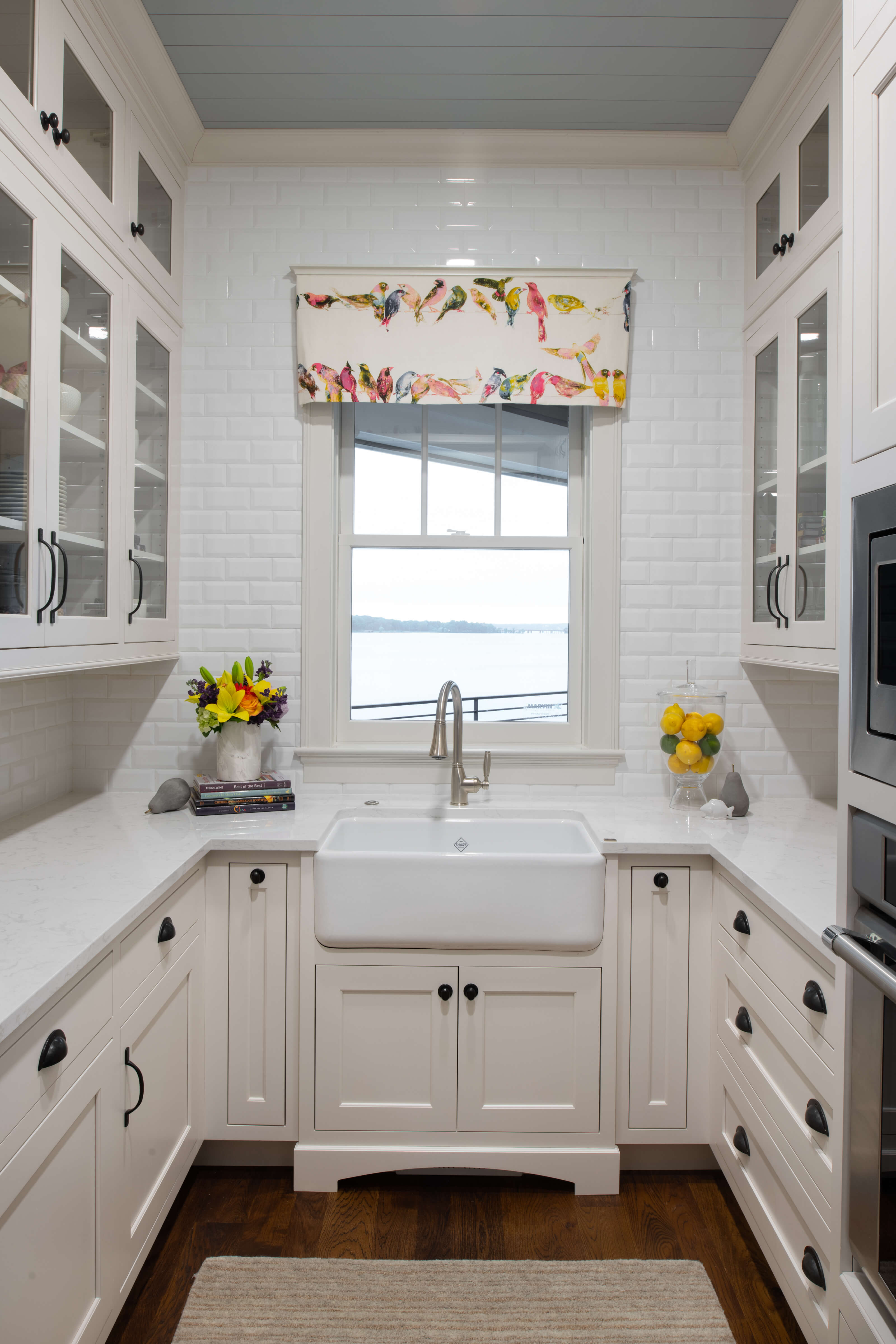
It can also help define a style- with a Ship Lap ceiling you can bring in a beachy vibe or a nautical vibe.
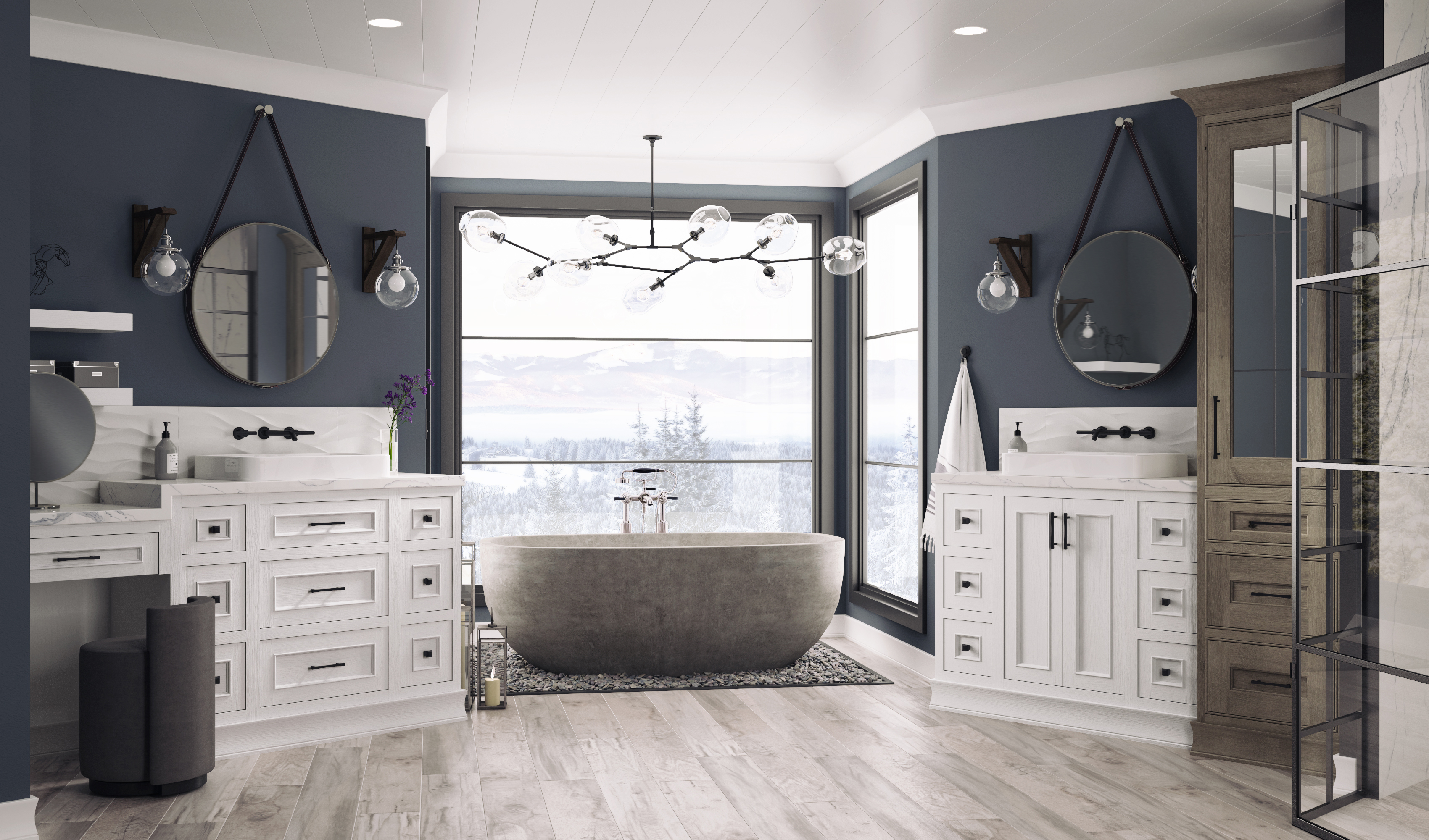
Ship Lap ceiling and entire bath by Dura Supreme Cabinetry
Painting the ship lap (below) is a beautiful touch.
Ship Lap ceiling painted pale blue-gray, Dura Supreme Cabinetry, Design by Revival House, Minnesota.
Dressing up the 5th wall can also be as easy as installing some applied molding. Notice the ceiling finish matches the window trim, really pulling together this hallway.
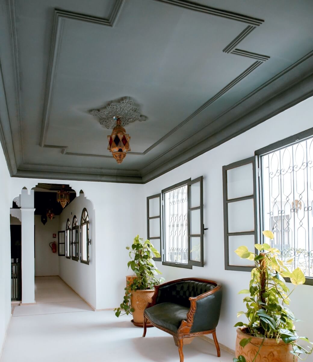
Applied molding on a ceiling can make a beautiful statement, photography by Toa Heftiba
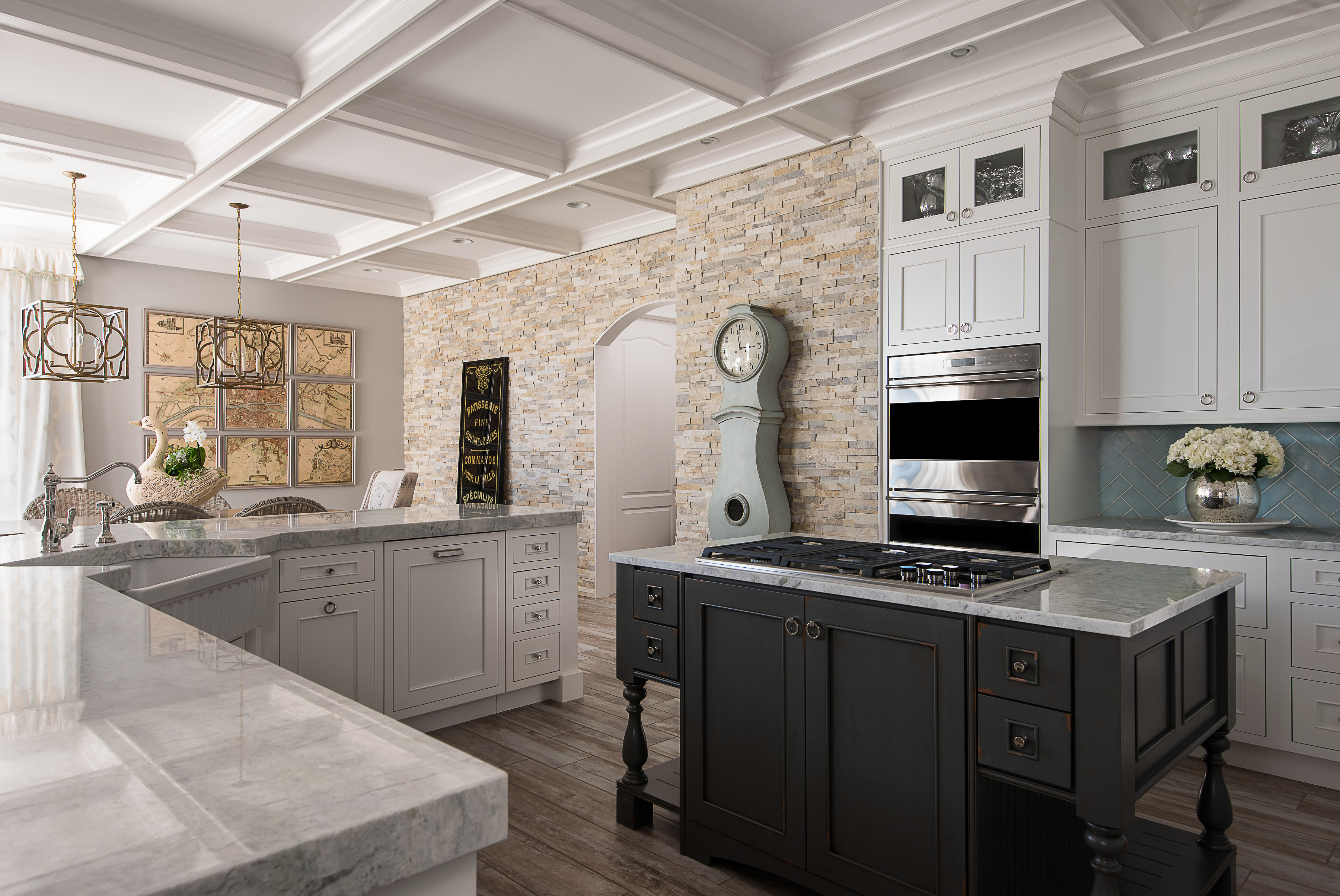
Coffers can give formality to a space and offer a way to splash some color into the space should you choose to paint the recessed areas. They require a bit more planning however, to ensure that the coffers sync with what is happening along the perimeter.
Glass has also been popping up more and more as a way to brighten up a space.
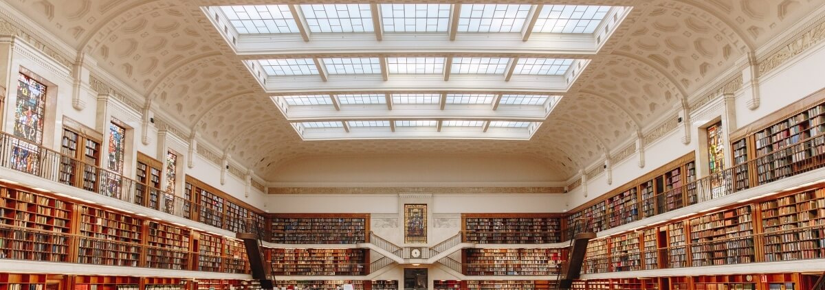
Library with mullioned skylights, Photography by Isaac Benhesed
Below we see a zen-like spa bathroom with a wood look tile ceiling and a window to the sky centered on a rain shower head.
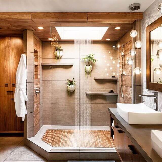
Skylight in shower, Design by Mantis Design Build in Minneapolis, MN
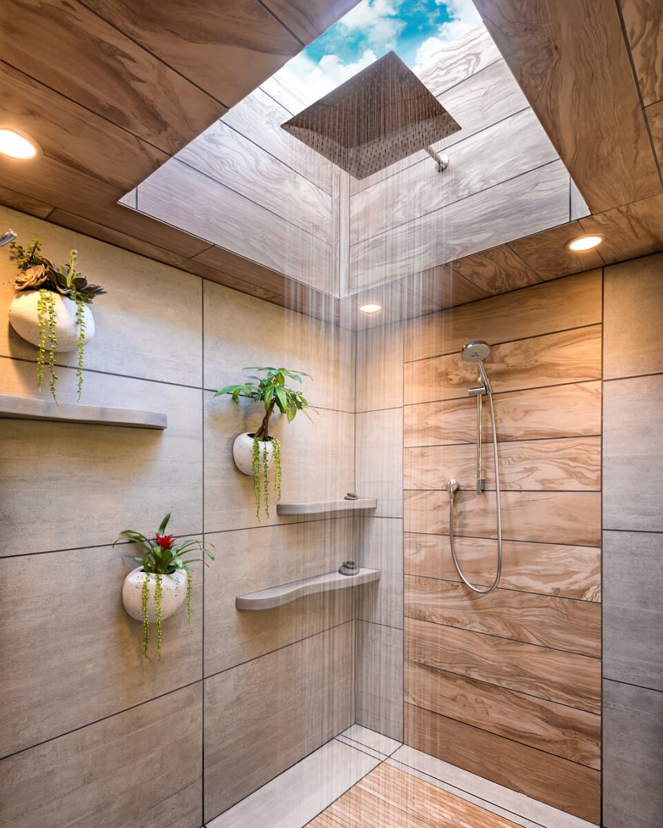
Close-up of skylight in shower, Design by Mantis Design Build in Minneapolis, MN
We’ve looked at a wide variety of ceilings here, and hopefully I’ve sparked your creative juices to design that perfect ceiling that will hit your design out of the park!
