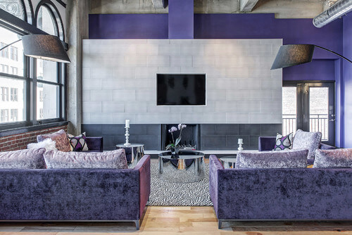
If you haven’t already heard, Pantone announced their Color of the Year for 2018 as Ultra Violet. This inventive, vibrant blue-based purple tone stirs the imagination into thinking outside the box.
Why Ultra Violet?
“The Pantone Color of the Year has come to mean so much more than ‘what’s trending’ in the world of design; it’s truly a reflection of what’s needed in our world today,” states Laurie Pressman, V.P. of the Pantone Color Institute. Depending upon the application of Ultra Violet, this color can be used to add tranquility or it can be used to generate positive, creative energy to liven up a space.
How can I incorporate Ultra Violet in my kitchen design?
There are two strategies that are used the most when it comes to incorporating a bold Pantone color like Ultra Violet into an interior design. The first tactic is using it as an accent color creating a color pop and the second approach is allowing the color to set the stage and take on a more prominent role.
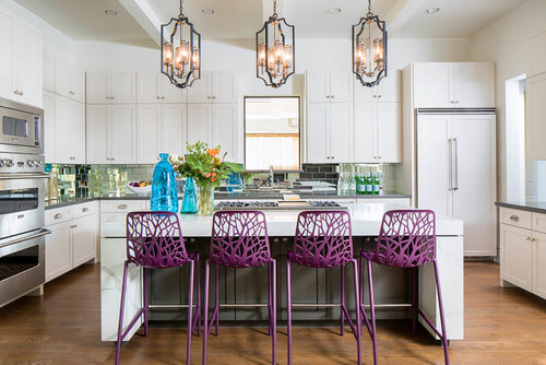
To create a color pop, select coordinating neutral colors for the walls, cabinetry, backsplash, etc. to create a neutral canvas. Then use the Ultra Violet color on the design element that you’d like to be the focal point of your space. Some examples may be a kitchen island, a hood, a kitchen appliance, seating or artwork. This creates a dramatic pop of color and adds contrast to your kitchen. This method is a popular choice because it’s easy to transition to a new trending color in the future.
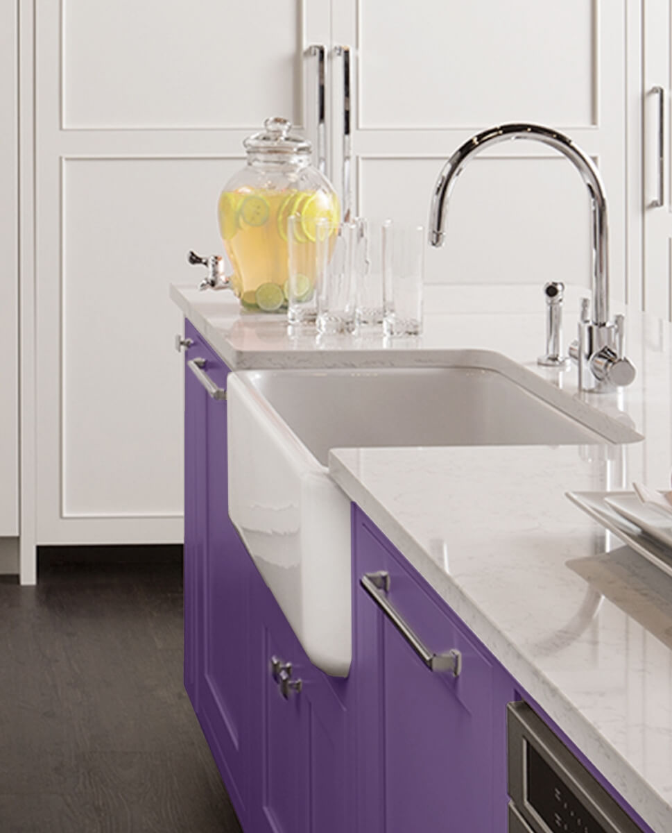
This Dura Supreme kitchen uses “Impulsive Purple” Personal Paint Match on the kitchen island to create a focal point.
To set the stage with Ultra Violet, let the color become the backdrop to your space by selecting it for a larger element like an accent wall, the countertops, the cabinetry or the backsplash, allowing the color to rule the space. Letting Ultra Violet take over the mood of a room can create an inviting feeling of creative energy, individuality, and meditation.
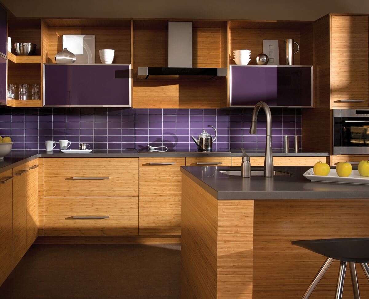
Dura Supreme Cabinetry shown in the Metro door style in Bamboo with a horizontal grain.
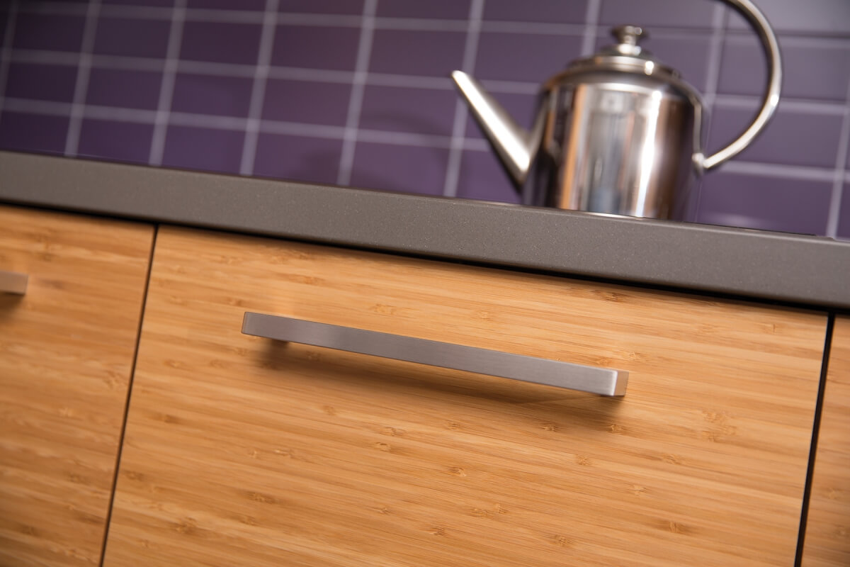
A Close up of Dura Supreme Cabinetry’s natural Bamboo with a horizontal grain.
How Can I Use Ultra Violet with My Cabinetry?
There are several ways you can incorporate this color into your cabinetry. If you’re a fashion forward individual and you’d like your cabinetry to perfectly match a specific Pantone color, like Ultra Violet, Dura Supreme’s Custom Finish Program will help you accomplish this beautifully. Simply send in the Pantone color sample and our finish experts will match it!
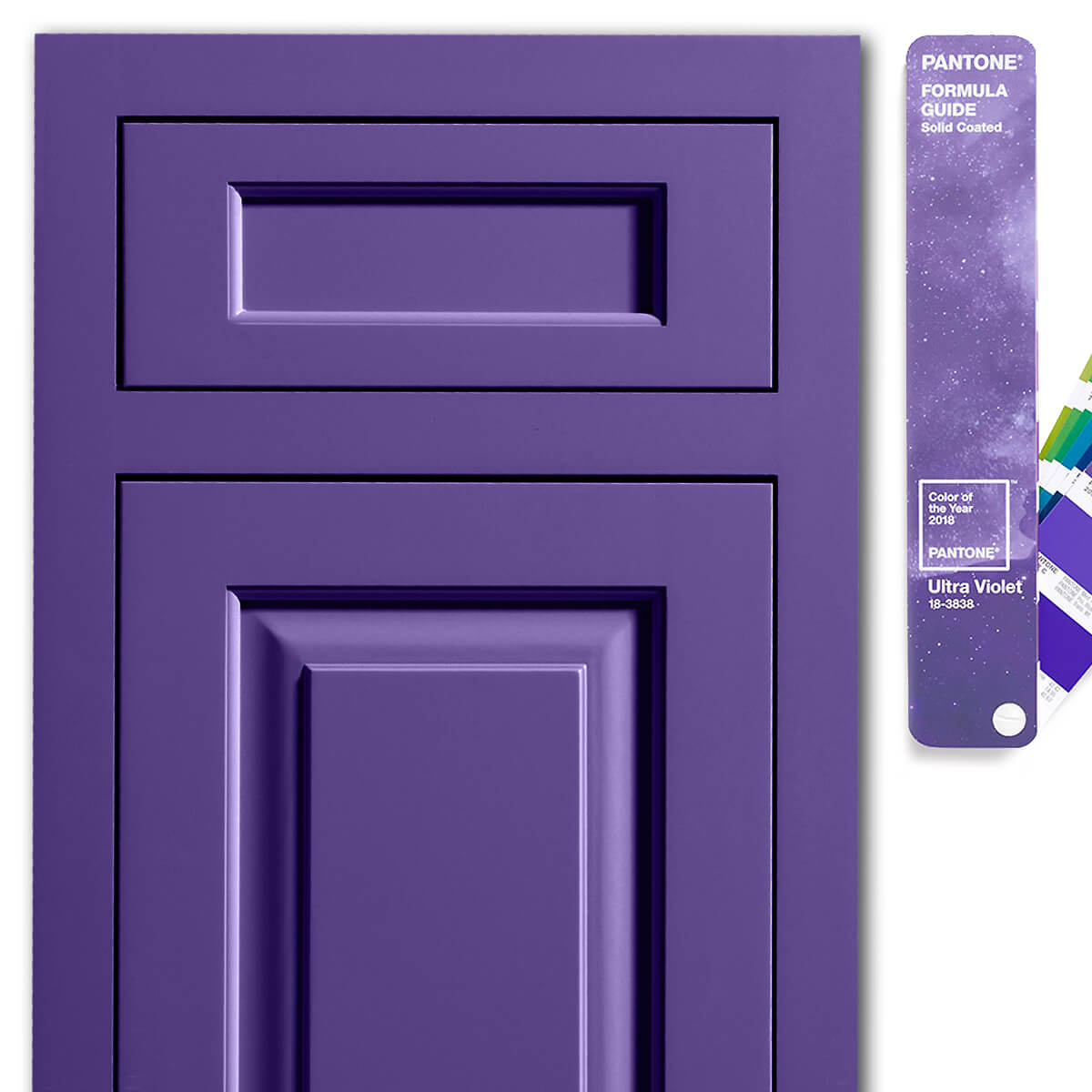
Dura Supreme Kendal inset door style in Custom Finish matched to Ultra Violet Pantone 18-3838.
You can also use Dura Supreme’s Personal Paint Match Program which utilizes the entire Sherwin-Williams color palette (and entire Benjamin Moore paint palette). If you need help translating a Pantone to a matching Sherwin-Williams color, try using one of Sherwin-Williams ColorSnap tools. They have several mobile, tablet, and desktop ColorSnap apps that will sample a color from Pantone or anywhere and identify the nearest match in the Sherwin-Williams paint palette.
My favorite tool is Sherwin-Williams Snap It Button that can be added to your internet browser. Once you’ve installed and set up the Snap It Button on your internet browser, simply go to Pantone’s website and look up the Pantone color you are interested in. Once you’ve located the color, click the Snap It Button on your browser and “Snap” the image.
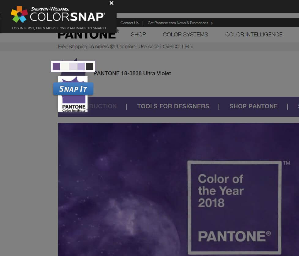
Here’s an example of Sherwin-Williams Snap It Button in action sampling the Ultra Violet Pantone color from Pantone’s website.
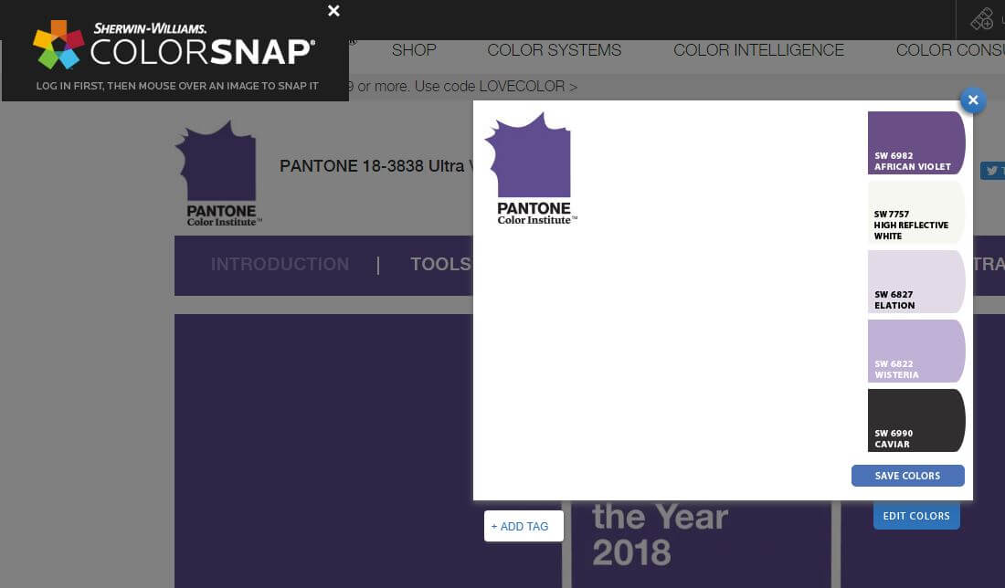
You can see here, the Snap It Button tool suggests Sherwin-Williams African Violet as the best paint match to Pantone’s Ultra Violet hue.
The Snap It Button tool will then identify Sherwin-Williams colors that best match the image. As you can see in the image above, it suggests Sherwin-Williams’ African Violet SW 6982 as the best match to Pantone Ultra Violet 18-3838.
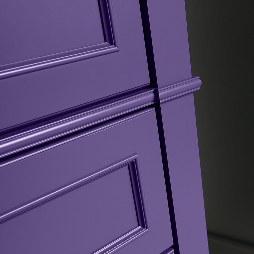
Dura Supreme Cabinetry with a Personal Paint Match finish in African Violet SW 6982.
How will you use Ultra Violet in your design?
