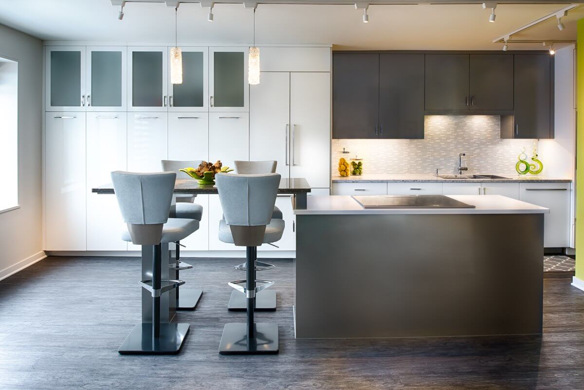
The kitchen layout is the shape that is made by the arrangement of the countertop, major appliances and storage areas. The layout and floor plan create the kitchen’s primary work triangle, which is the path that you make when moving from the refrigerator to the sink to the range when preparing a meal.
When designing your new kitchen and choosing the best cabinetry solutions for your home, one of the first considerations is the overall layout of the kitchen.
There are five fundamental layouts for most kitchens – Galley, L-Shaped, U-Shaped, G-Shaped, and Single Wall. Over the next few weeks, we will explore each of these different kitchen layout styles in more detail.
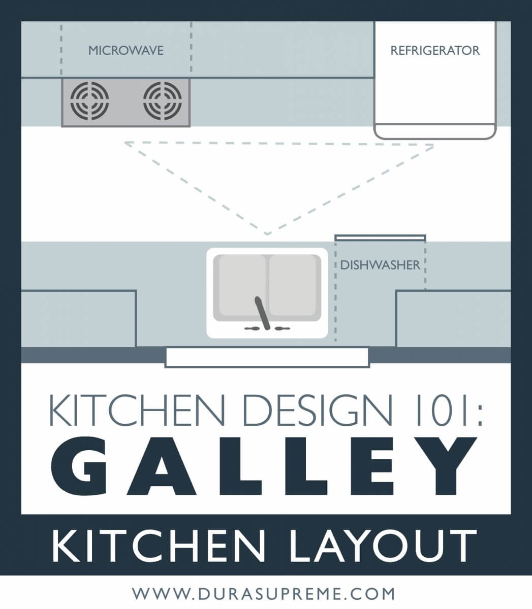
What is a Kitchen Galley Layout?
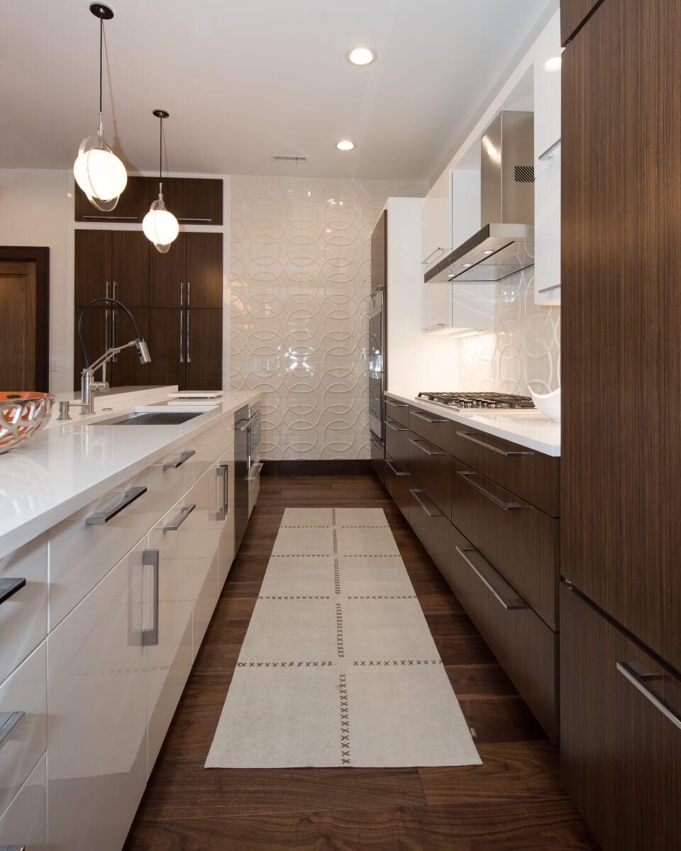
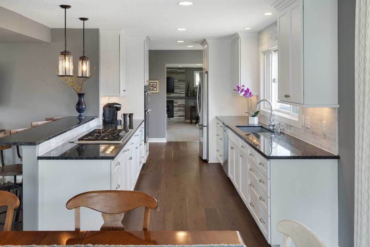
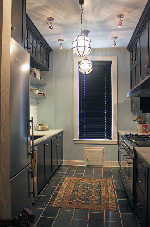
A galley kitchen design layout (also known as the corridor kitchen layout) consists of a three to five-foot corridor or walkway situated between two parallel walls or runs of cabinetry. Named after its predecessor, a compact kitchenette area or “galley”, which you would find on a nautical vessel or ship, is commonly designed for a one-person cook due to its small size. Typically, the Galley kitchen will have two workstations that face each other: one wall featuring the cooking components and the opposite wall consisting of the prepping/cleaning fixtures. This type of kitchen layout is ideal for smaller-scale kitchens and has also been found to be quite preferable for many professional chefs because it provides a tight, efficient work triangle and enhances the safety of the chef when cooking meals. However, the caveat that comes with the Galley Layout is the stigma that the design seems too small or narrow in size.
- Despite its stigma, there are several tips and tricks you can apply to help create the illusion that your kitchen is larger in size:
1. Starting with your flooring – whichever flooring material you decide to incorporate into your Galley kitchen, make sure that the flooring runs lengthwise and parallel to the walls to give the illusion that the kitchen is longer.
2. Your kitchen backsplash – consider arranging the kitchen backsplash material in the opposite direction of your flooring’s orientation to create the illusion of depth and height in the space.
3. Cabinetry & appliances – consider hiding your kitchen appliances entirely by utilizing appliance panels that mimic the appearance of your selected cabinetry. Also, running the cabinetry from floor to ceiling will add the illusion of height to the space.
4. Simple is best – clean lines with the least amount of adornment also give the impression of a larger space, so try to keep your cabinetry, appliances, and finish selections simple and clean.
5. Color scheme – consider keeping your color scheme light and bright in your Galley kitchen. Lighter colors make spaces feel more open and airy, while darker tones can make a space feel small and sometimes claustrophobic.
6. Storage – last but not least, Galley kitchens can pack an abundant amount of functional storage in a small area. Maximize your storage space by stacking cabinetry and incorporating internal cabinetry organizers like cutlery dividers, spice storage, tray dividers, and roll-out shelves into your cabinetry design.
Inspiring Galley Kitchen Designs
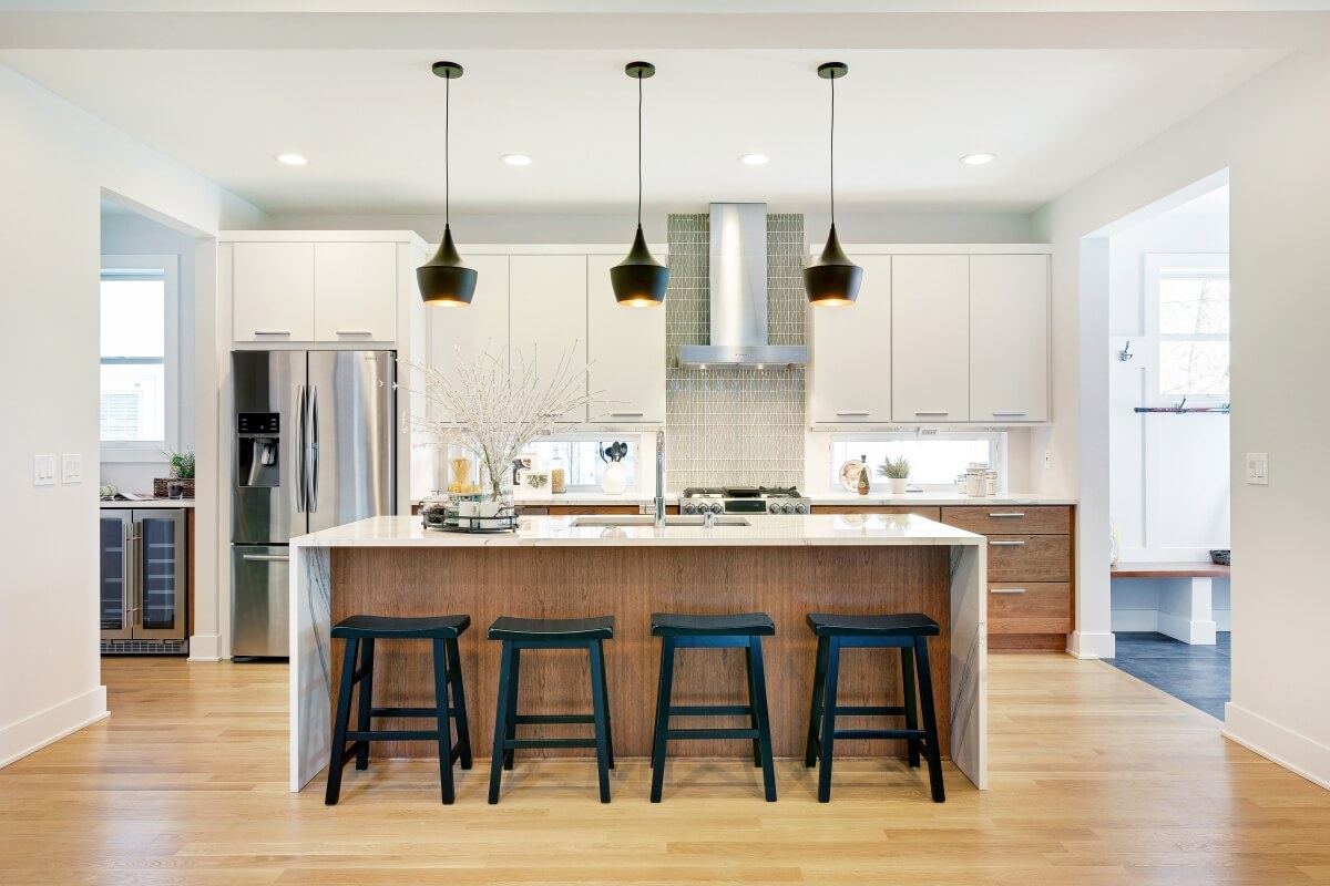
Below are a few examples of some exquisite Galley Kitchen Layout designs:
To learn more about how to optimize your kitchen layout, contact your local Dura Supreme Showroom. Stay tuned for my next blog when we explore the L-Shaped Kitchen design layout.
