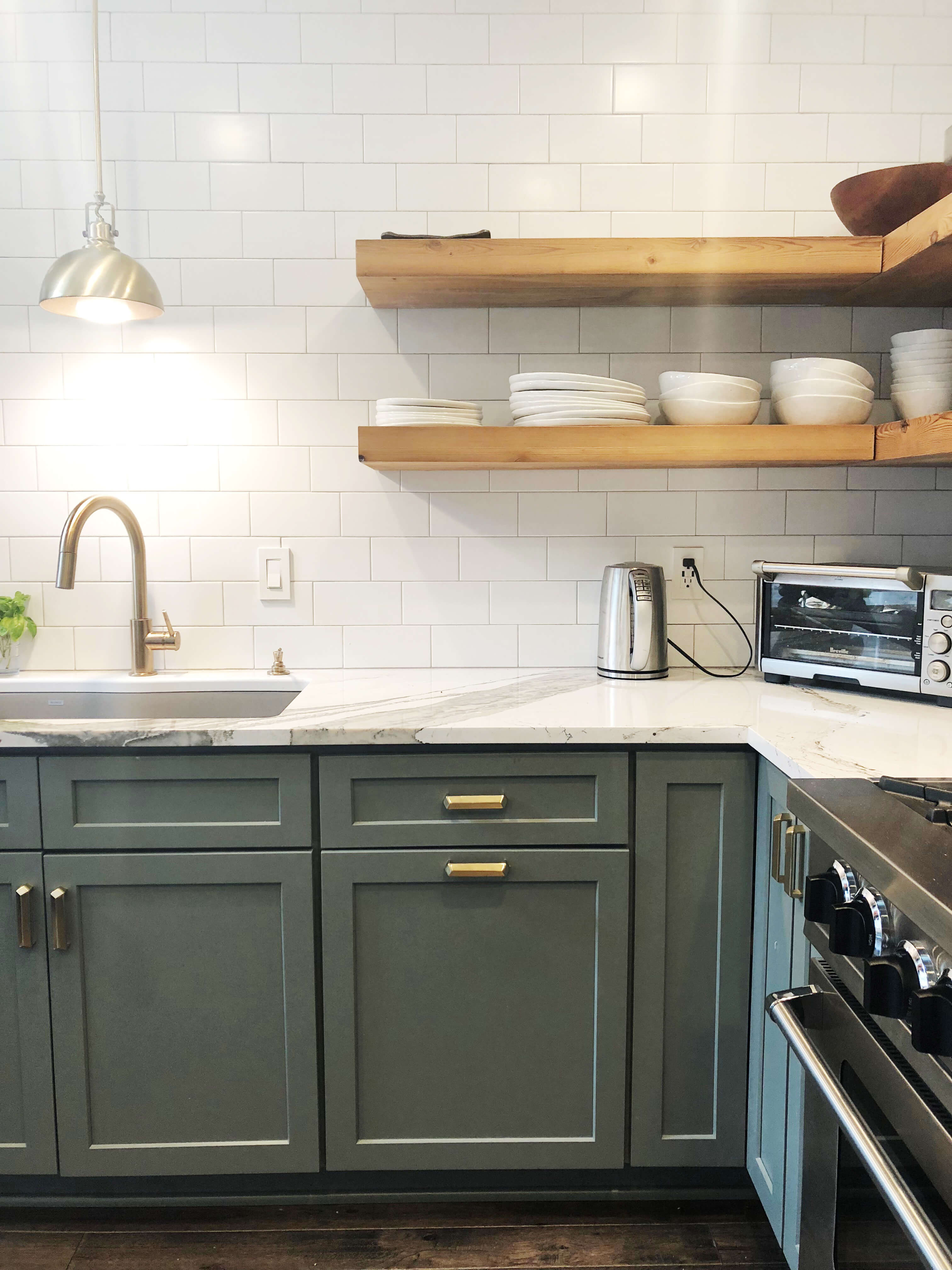
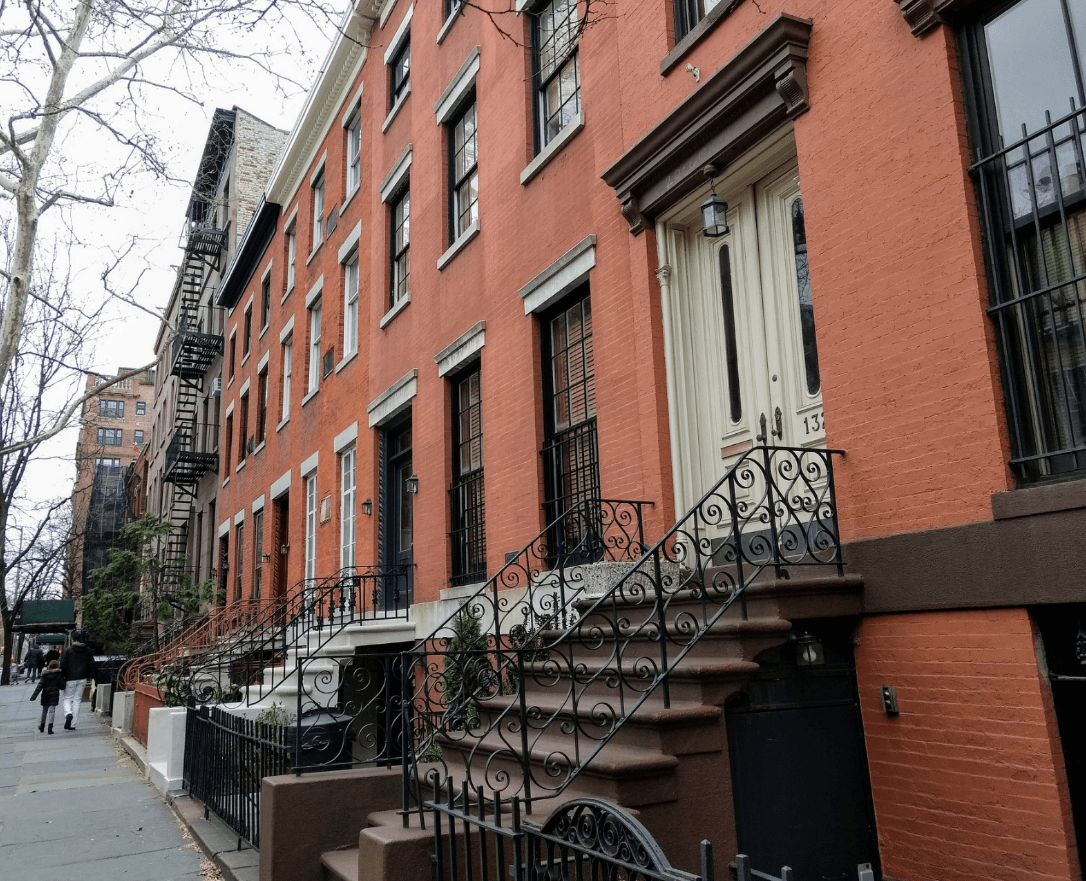
Picture an 1890s architectural home located in Buffalo, New York, and within its walls is a cramped little kitchen in dire need of updating.
The homeowners of this cramped little kitchen had a vision for their remodel project and were very clear about what they wanted to achieve in the final design of their kitchen. Which is why they contacted Jon Tober, with Artisan Kitchens & Baths, to take on the task of blending their kitchen ideas with the original architecture of their home.
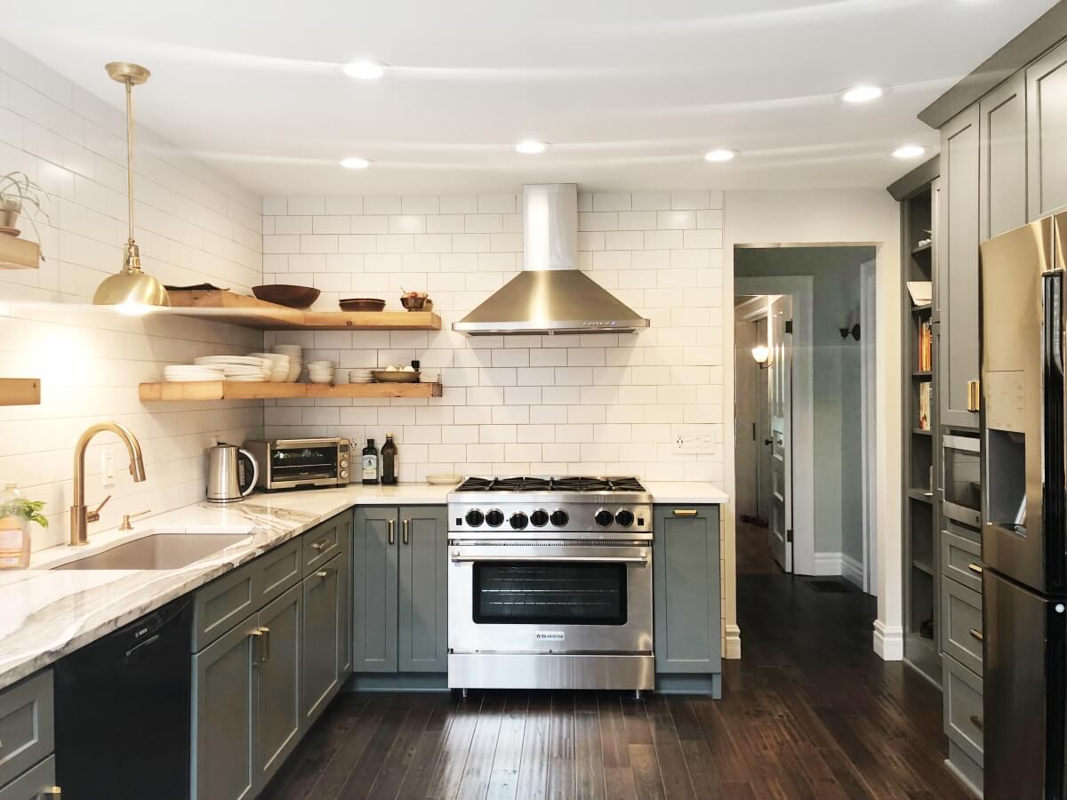
Kitchen Design by Jon Tober of Artisan Kitchens & Baths featuring Dura Supreme Cabinetry.
“The clients’ asked for an updated neutral color palette, a commercial range, and no wall cabinetry”, stated Jon Tober. “In the initial design concept, I started with separating the previously cramped appliance locations then started to layout preliminary cabinetry based on the clients’ interview of their storage needs.”
Together both Jon and his clients made selections to incorporate a 36” commercial BlueStar Range into the kitchen design that paired beautifully with the selected Dura Supreme Cabinetry in the Hudson Panel Plus door style in the Attitude Gray Curated Color collection paint finish. Staying true and consistent with the desired neutral color palette, dark hand-scraped hardwood floors, Cambria Skara Brae quartz countertops, and a simple classic white subway tile were selected and highlighted not only the beautiful vein pattern in the countertops but the gorgeous reclaimed Hemlock floating shelves.
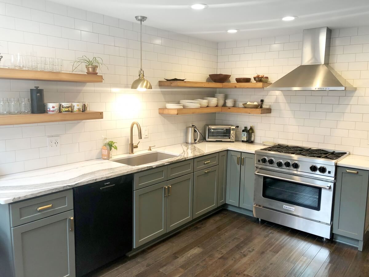
A cramped kitchen transformed into a charming, timeless open-concept kitchen featuring a neutral color palette and natural textures.
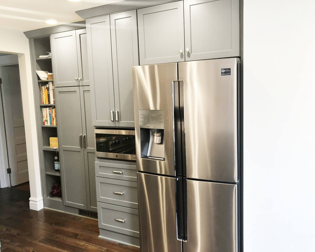
The original appliance locations were separated to reduce the feeling of crampedness in the kitchen.
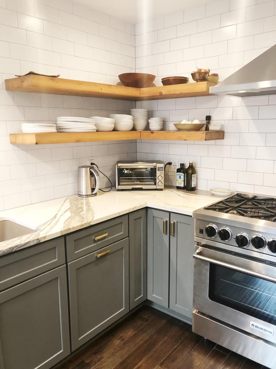
The original appliance locations were separated to reduce the feeling of crampedness in the kitchen.
During the remodeling process, Jon stated that his “clients were a pleasure to work with and they are thrilled with the end result.” “I am also very happy with the final product, Jon said, I believe it turned out trendy, but also timeless, which is key.”
