I hate to break it to you, but color does not exist! “What?!” you may be thinking. The reality is that color is actually created by our brains as we try to process “light signals” received by our eyes. How we process these “signals” can vary as everyone is “wired” a little differently. Color is all in our heads!

Color is all in our heads!
So if color is all in our heads… how do we select colors for our homes?
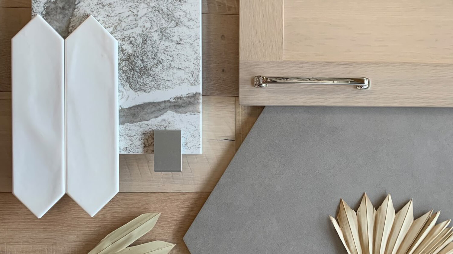
Design concept by Village Home Stores in Geneseo, Illinois featuring Dura Supreme’s Parker door style in the “Alabaster” stain on Quarter-Sawn White Oak.
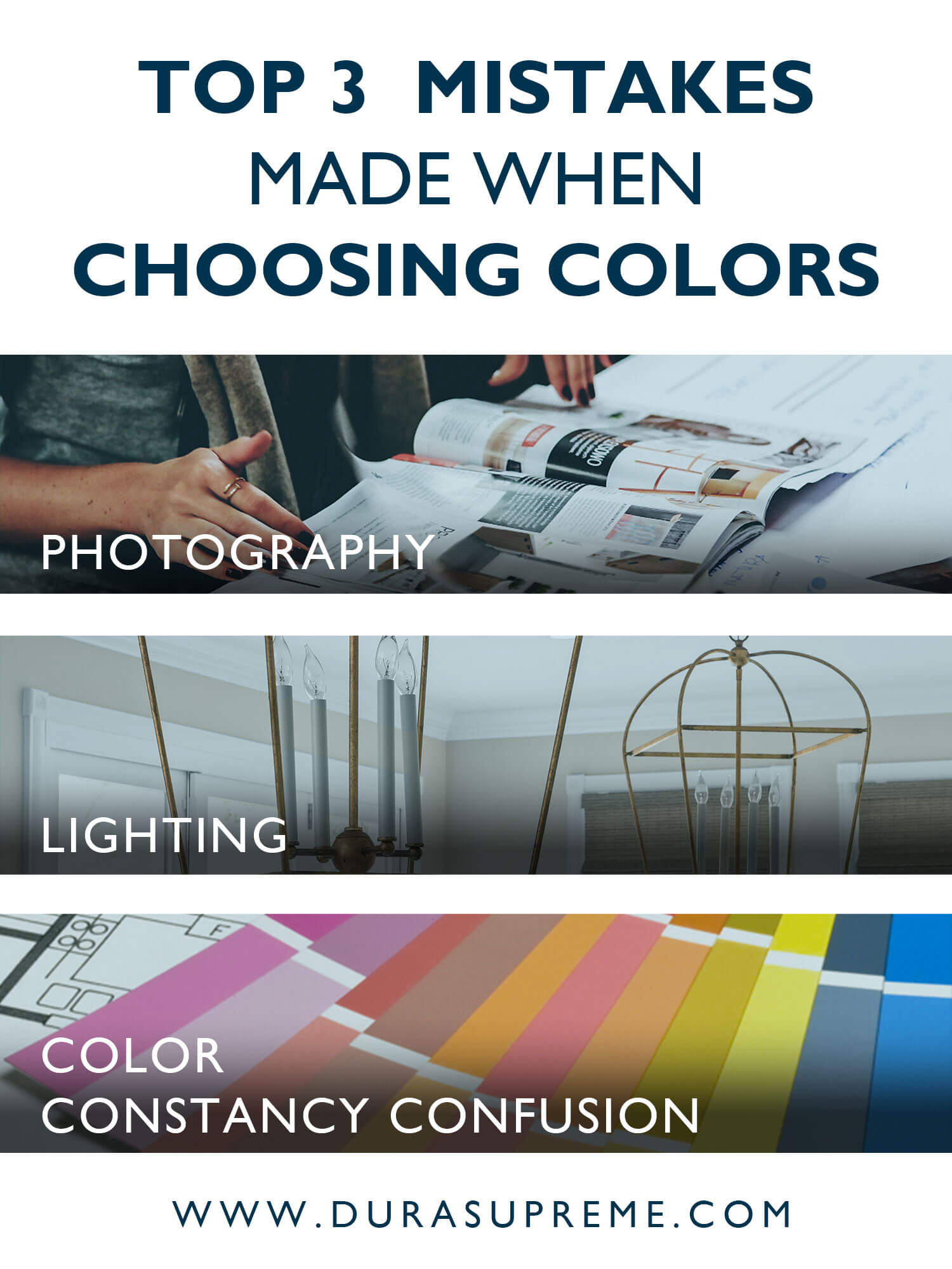
Top 3 Common Mistakes Made When Choosing a Color
It’s important to know that there are three common tricks that color plays on us especially when planning an interior design. These deceptive color tricks can alter colors, fooling you into thinking you’re purchasing your desired color at the store, only to be disappointed when you bring them into your home. Here’s what to look out for…
How can Screens & Printed Materials Distort Color?
When a photo is taken, the color of that object is converted into an electronic device. The photo is then sent to another device to be edited and posted online to be viewed either on a screen or as a printed image. Both screens and printed materials convert colors an additional time into different primary color models. By the time you view a photo with your eyes, it’s gone through multiple steps of color conversions (I.E. primary color models RYB, RGB, and CMYK). These color conversions can lead to distorted or misinterpreted color.
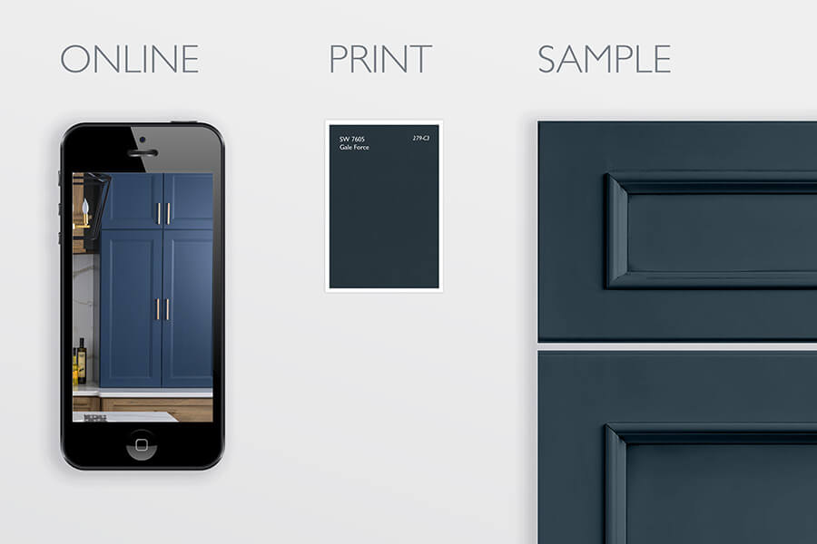
Photos are a useful tool to help inspire us and narrow down our options, but they should not be used to make a final decision. Make sure to see the actual product in person before making any final decision, especially when shopping for products that make a big impact on your interior design, like cabinets, counters, flooring, wall coverings, etc.
How can Lighting Affect How We Perceive Color?
Colors can appear different under varying lighting sources. For example, if you view a navy blue cabinet sample under fluorescent lighting at a showroom and then view that same sample with abundant natural light at home, the blue shade will look different in each environment.
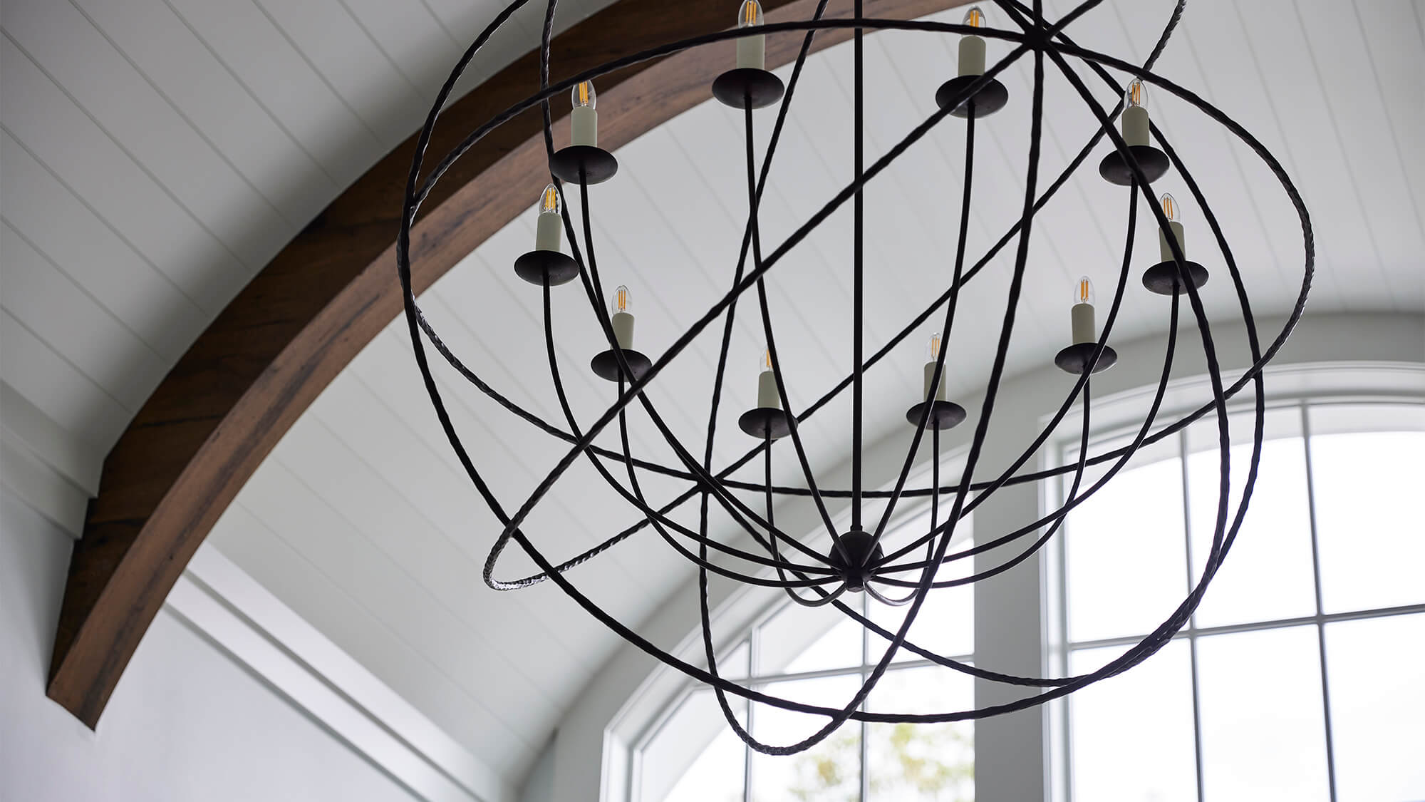
Design by Megan Dent, Allied ASID, NKBA of Michels Homes, Twin Cities, Minnesota. Photography by Alyssa Lee.
What is Color Constancy Confusion?
First off, color constancy is a cognitive process that enables our brain to recognize a color regardless of variations in lighting conditions. However, when the available information is distorted, or not there, our brain can be deceived, leading to what’s known as Color Constancy Confusion. For instance, in a photo, if shadows or the time of day are not apparent, our brain may fill in the missing information and perceive a color as either one color or another.
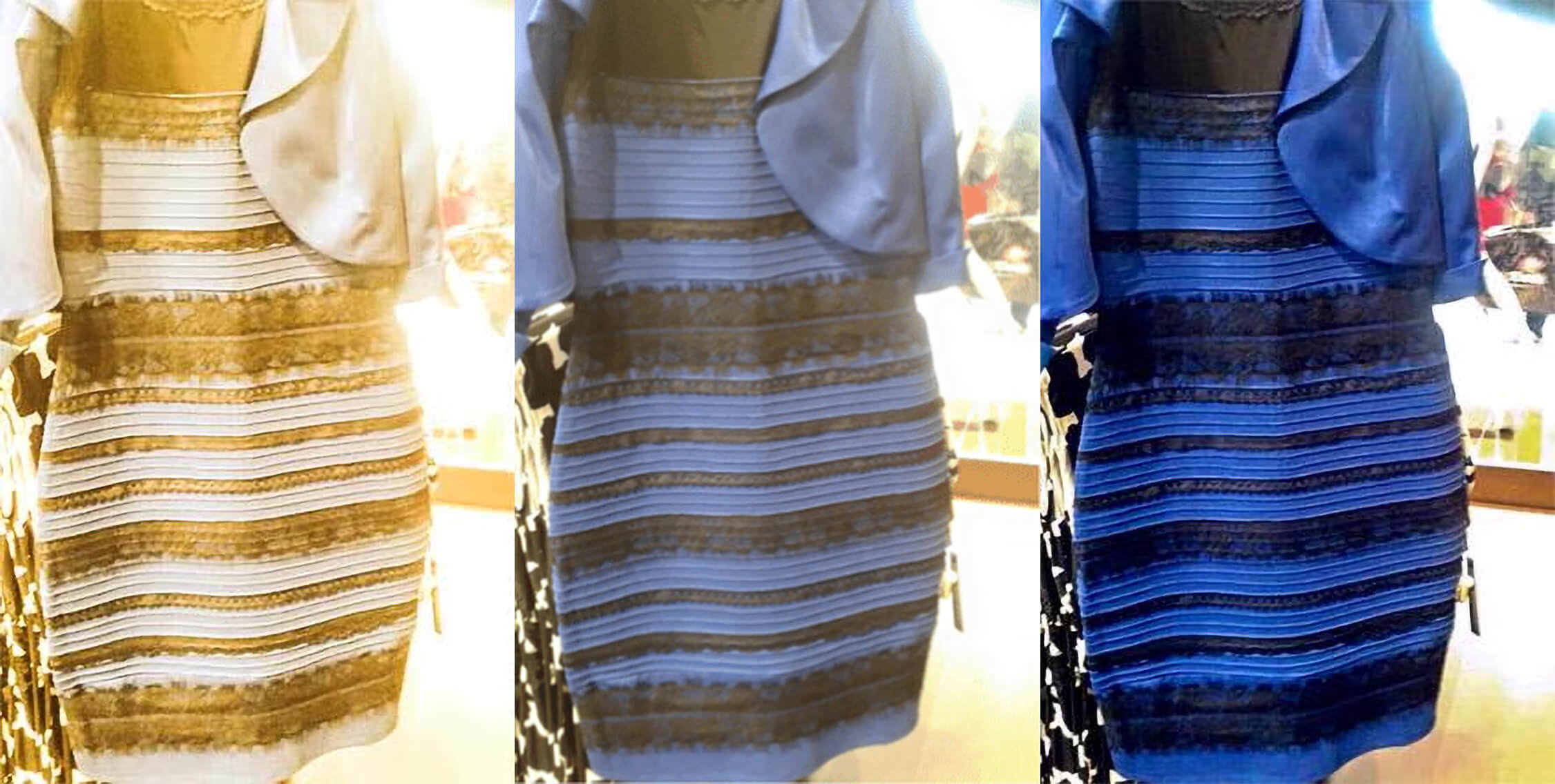
Are you familiar with the Gold Dress VS. Blue Dress viral debate? Some people look at the original (middle photo) and see a white and gold dress (like pictured on the left), while others see a blue and black dress (like pictured on the right.
How do I avoid making these top color mistakes?
Avoiding all of these common color mistakes is actually very simple.
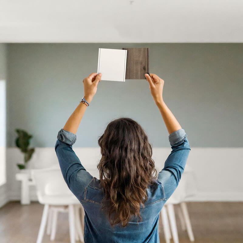
- Try to view as many of the final finish sections in person. If possible, also view them while standing in the room you plan to remodel. This will give you the most accurate environment in which to choose your final color selection.
- Don’t make your final selection ONLY based on the appearance shown in any photograph. That includes magazines, brochures, online photography, videos, screens, and even developed photographs.
- Although viewing samples in a showroom gives you a great understanding of their color, texture, and quality. If you have the option, try not to make your final selection from samples only seen in a showroom or any location other than your home. Try your best to view the final selection of samples in your home in the space in which you plan to incorporate them to get the best understanding of how they will appear in your home.
Today, we have a myriad of resources at our fingertips. Online platforms like Houzz and Pinterest are incredible tools that are handy for planning our homes, finding inspiration, and learning about products that fit our needs… Yet, I see so many people selecting their final finish colors from an online photo, purchasing on the spot without seeing an actual sample, and then being shocked it was not the color that they expected. It’s one thing when it’s small items like a throw pillow or a vase that you can easily exchange, but you don’t want to make that mistake with a long-lasting investment like cabinetry.

Houzz.com is a fantastic tool for finding inspirational photos and ideas for your remodel project.
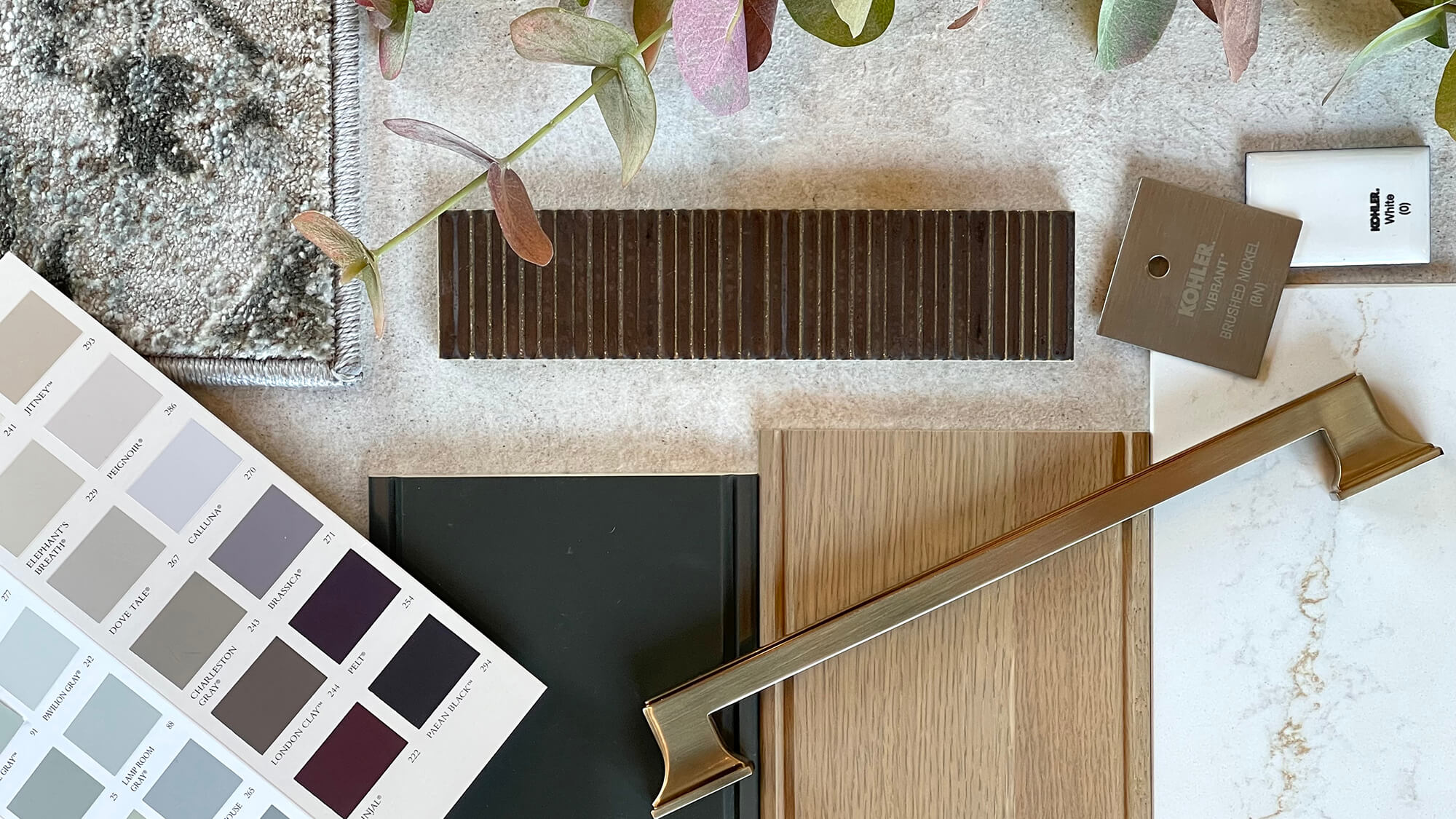
Usually, most suppliers who offer finishing products like cabinets, paints, carpets, countertops, tiles, etc., offer samples that you can take, borrow, or purchase and bring home for just this purpose. Products such as large appliances may be difficult to view a sample in your home before purchasing, but I still recommend viewing them in person and comparing them to your other finish choices before making your final selection. This will help avoid any unpleasant surprises.
Kitchen design concept by Kitchen Design Center by Gramophone in Hunt Valley, Maryland featuring Dura Supreme Cabinetry’s “Coriander” stain on Quarter-Sawn White Oak with a sample of “Rock Bottom” paint.
Get Inspiration from Photos Not Final Decisions
This doesn’t mean you can’t start your selection process with your designer at the showroom or get ideas online and in magazines. Just take the time to see samples in person and bring samples home after you’ve narrowed down your ideas to make sure they still look as you expect them to. It may seem silly, but in the long run, it could save you a lot of time and money by ensuring there will be no surprises. No one wants to have their cabinetry arrive and be a different color than what they were expecting.
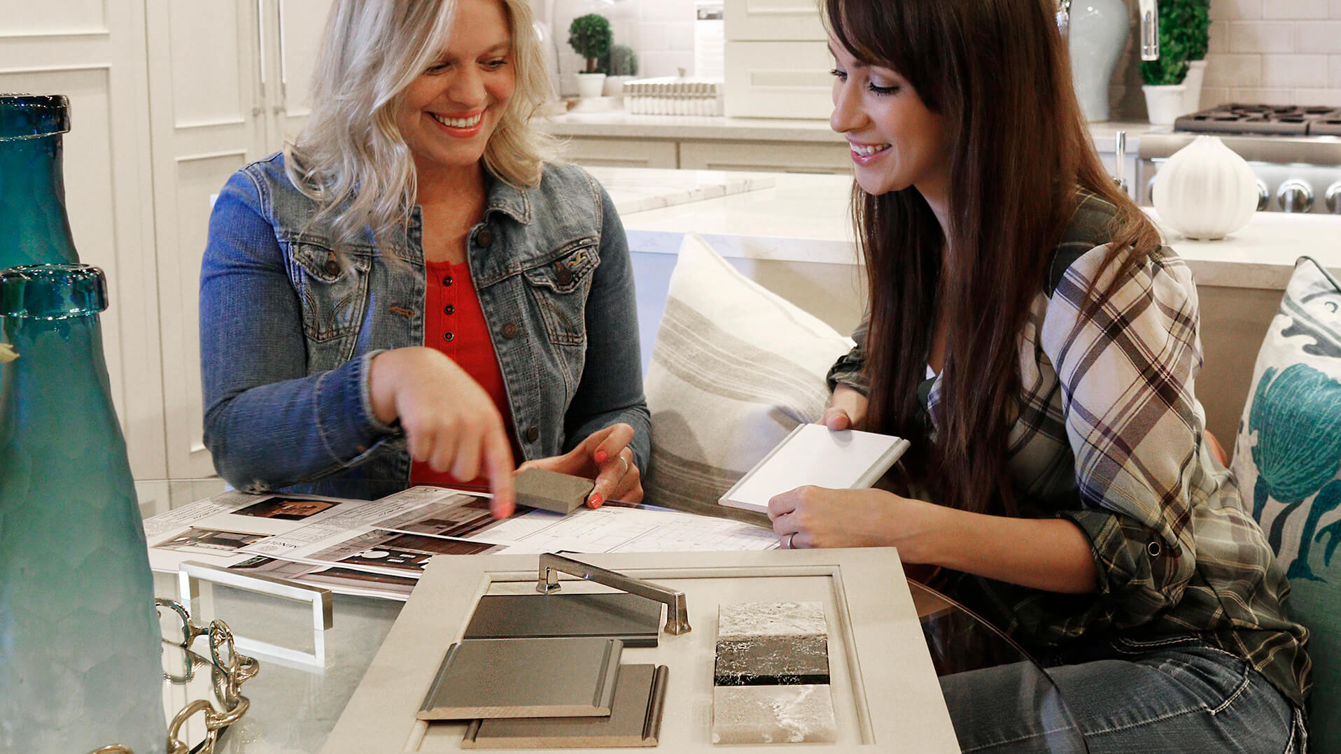
I hope these tips will help you to be prepared as you undergo your design journey. For personal help in choosing the best color for your cabinets, counters, finishes, etc., stop by your local Dura Supreme Showroom to talk to a designer and see samples in person.
Learn more about best practices for selecting colors for your home from our Making Selections Guide.
Check out the other blogs in this series about color tricks: