Remodeling your kitchen is not a small project. A lot of loose ends have to come together, to avoid unexpected costs or delays. I believe the best way to prevent a mistake is to know what mistakes are most commonly made. Here are my top 10 kitchen design mistakes to watch for and how to avoid them.

1. Whoops! I Forgot to Double-Check All My Measurements.
Always measure twice … design once! When it comes to kitchen design, every inch counts. In fact, every 1/16″ of an inch counts!
Inaccurate measurements are one of the most common kitchen design mistakes. If you’re not having a professional do the measurements and don’t double-check your work, it’s possible your cabinets, countertops, appliances, sink or even hardware will not fit when you’re ready to install.
The Rule of Accuracy, If it Doesn’t Fit … Don’t Force It!
Designing a kitchen is like putting together a gigantic jigsaw puzzle with countless shapes and sizes that must fit together perfectly to complete the picture. Inaccurate measurements can cause delays to the project, unforeseen expenses, stress in your household, and headaches you could be forced to suffer for many years if not corrected.
2. Ignoring Standard Clearance Recommendations & Requirements
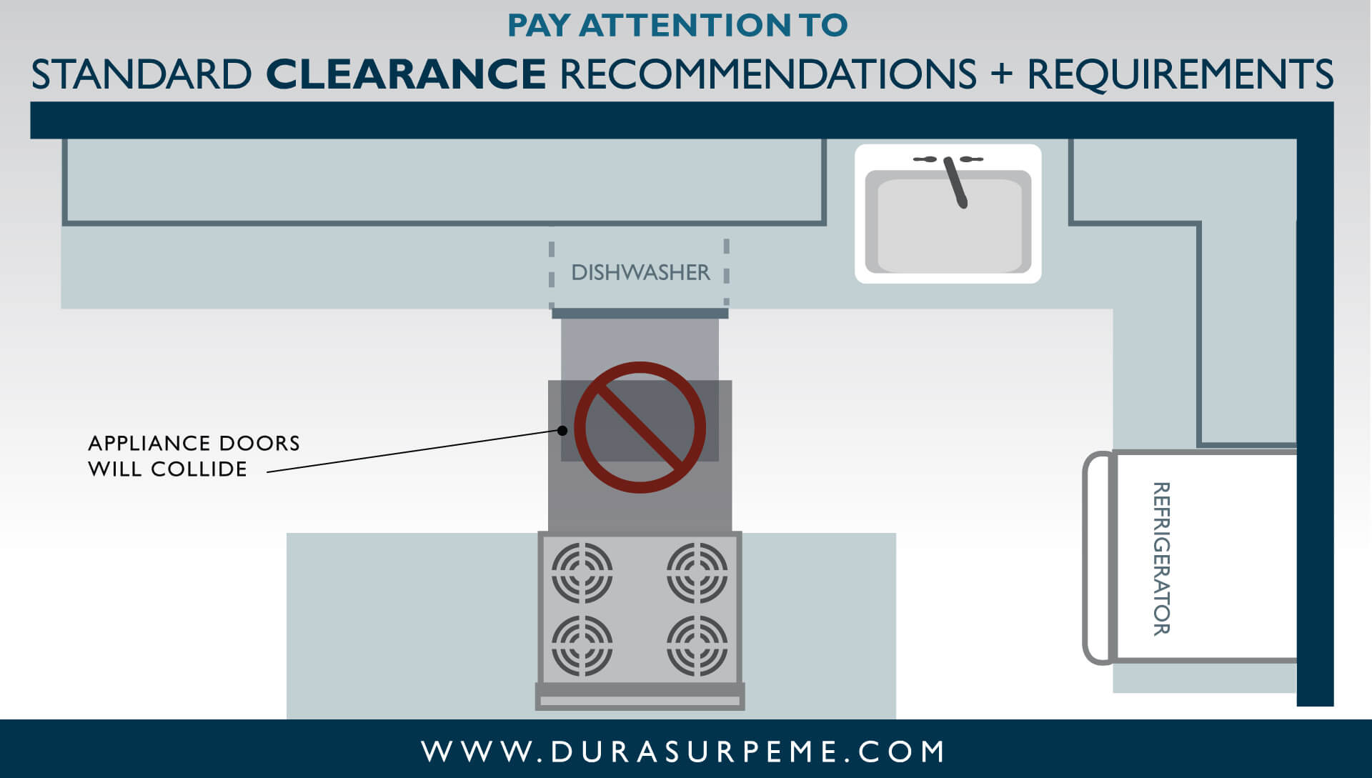
Continuing on the subject of measurements … take note of the different items in your design that need space to function and ensure that there are proper clearances within the kitchen. For a kitchen to be functional, allow ample space for cabinet and appliance doors to open fully without hitting each other or any obstacles.
3. Collisions Can Happen in the Kitchen Too!
Just like driving, if you’re not paying attention to your surroundings during the design process, a collision can happen in the kitchen too. This is why it’s important to pay attention to potential collisions, especially with items that are placed at a 90-degree angle to one another. Note how all doors, drawers, and appliances will move and look out for any possible obstacles that could interfere with their operation.
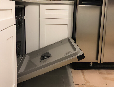
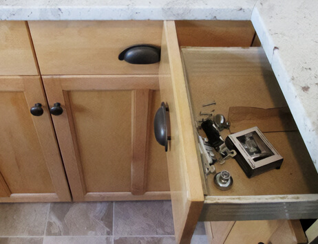
This homeowner didn’t think they needed help from a designer… now they’re dealing with this headache daily (see the pictures below).
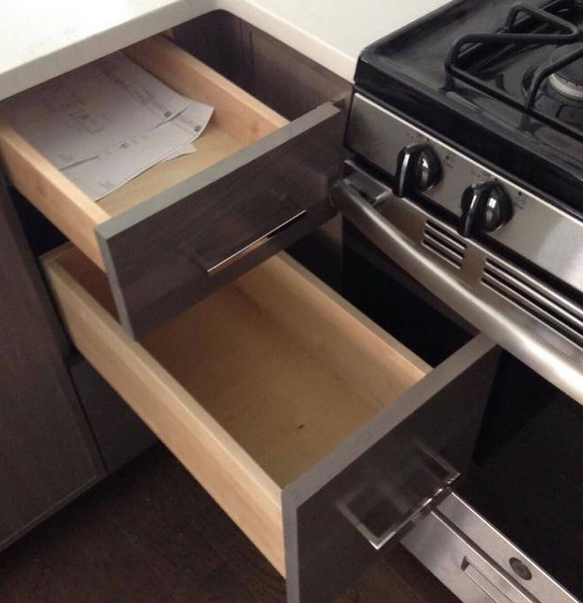
Eeek! Photo courtesy of @rbc_construction_inc on Instagram.
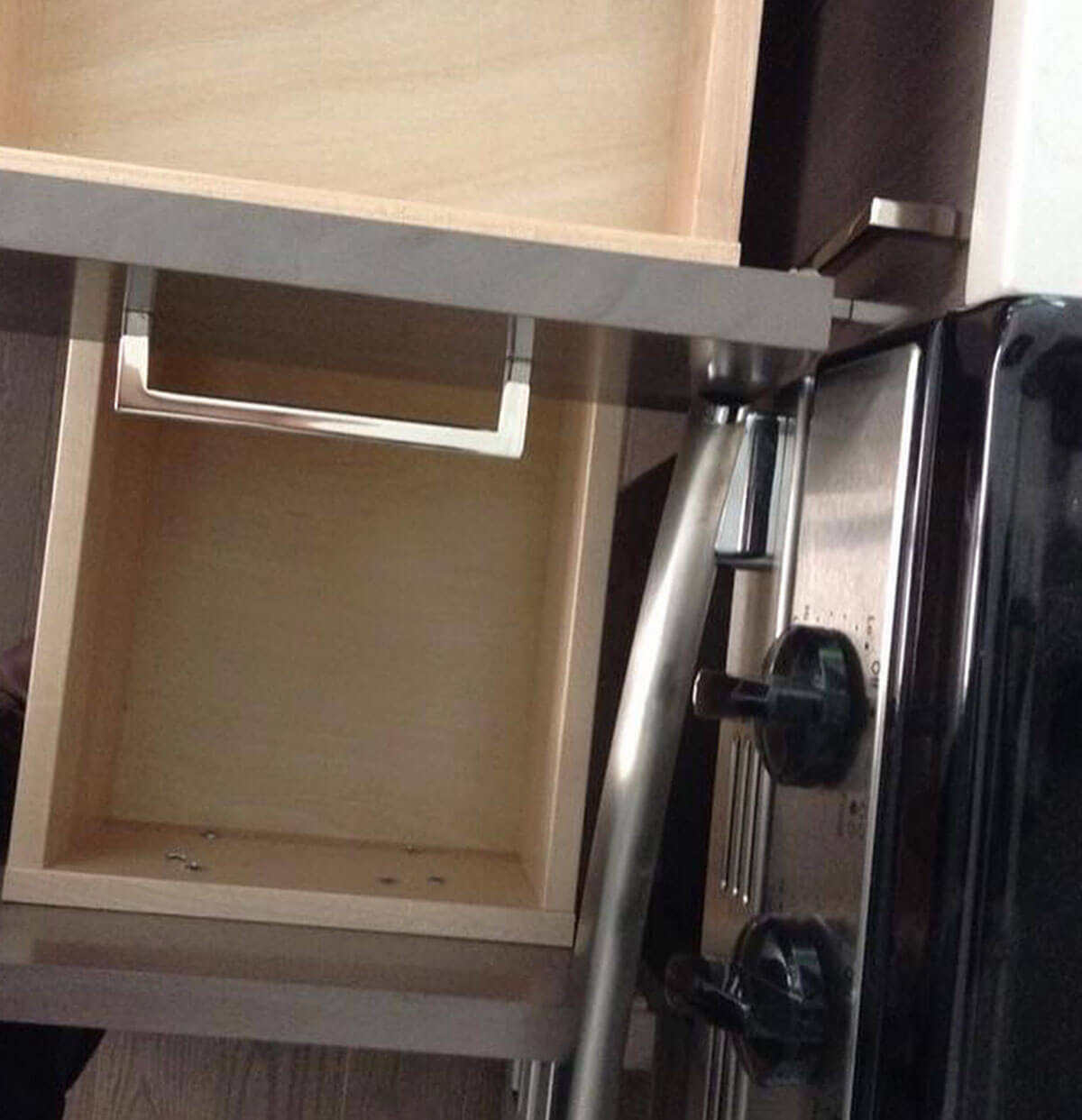
It just hurts to see how very little this drawer opens! Photo courtesy of @rbc_construction_inc on Instagram.
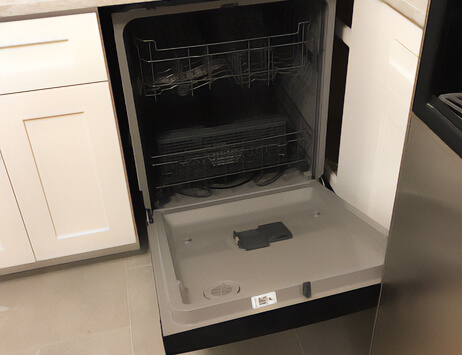
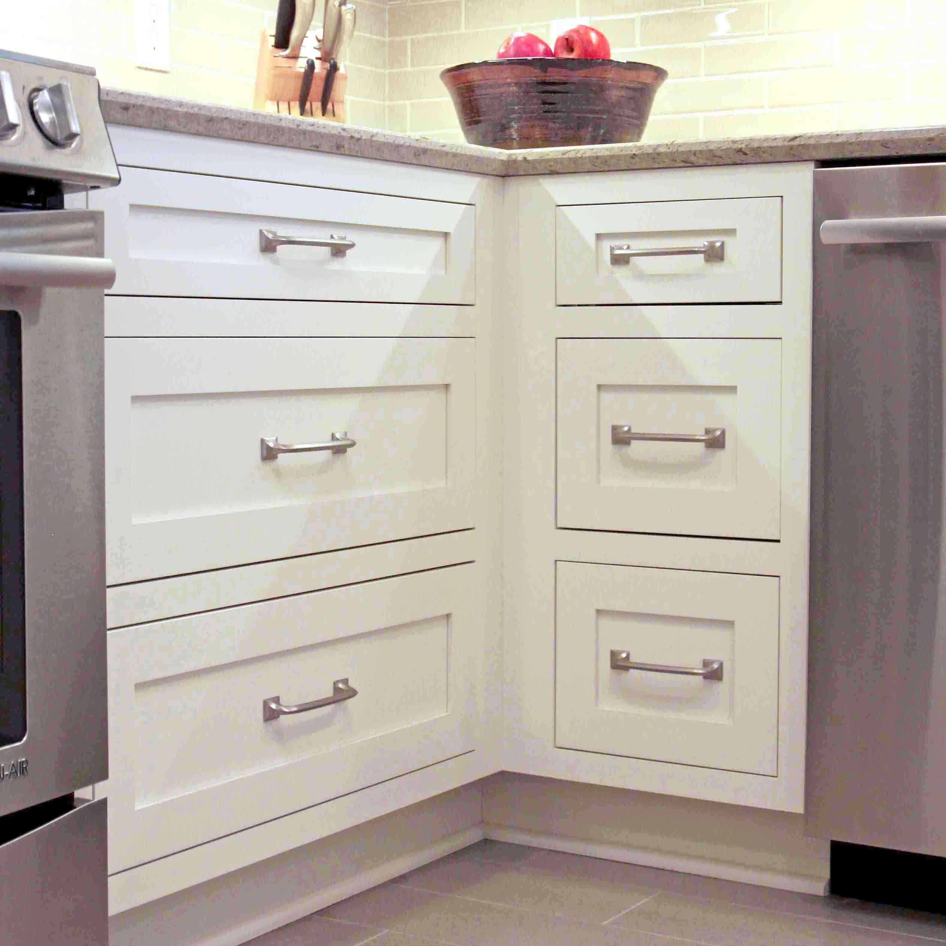
In the well-designed kitchen example below, the designer allowed additional space between the cabinet and the corner to allow for the drawer to open fully without colliding with the large appliance handle of the dishwasher, which is placed on the adjacent wall. The slight change to the corner is unnoticeable and seamless but if the designer hadn’t made adjustments you would have definitely noticed the constant banging of the drawer into the appliance and lack of being able to fully open the drawer.
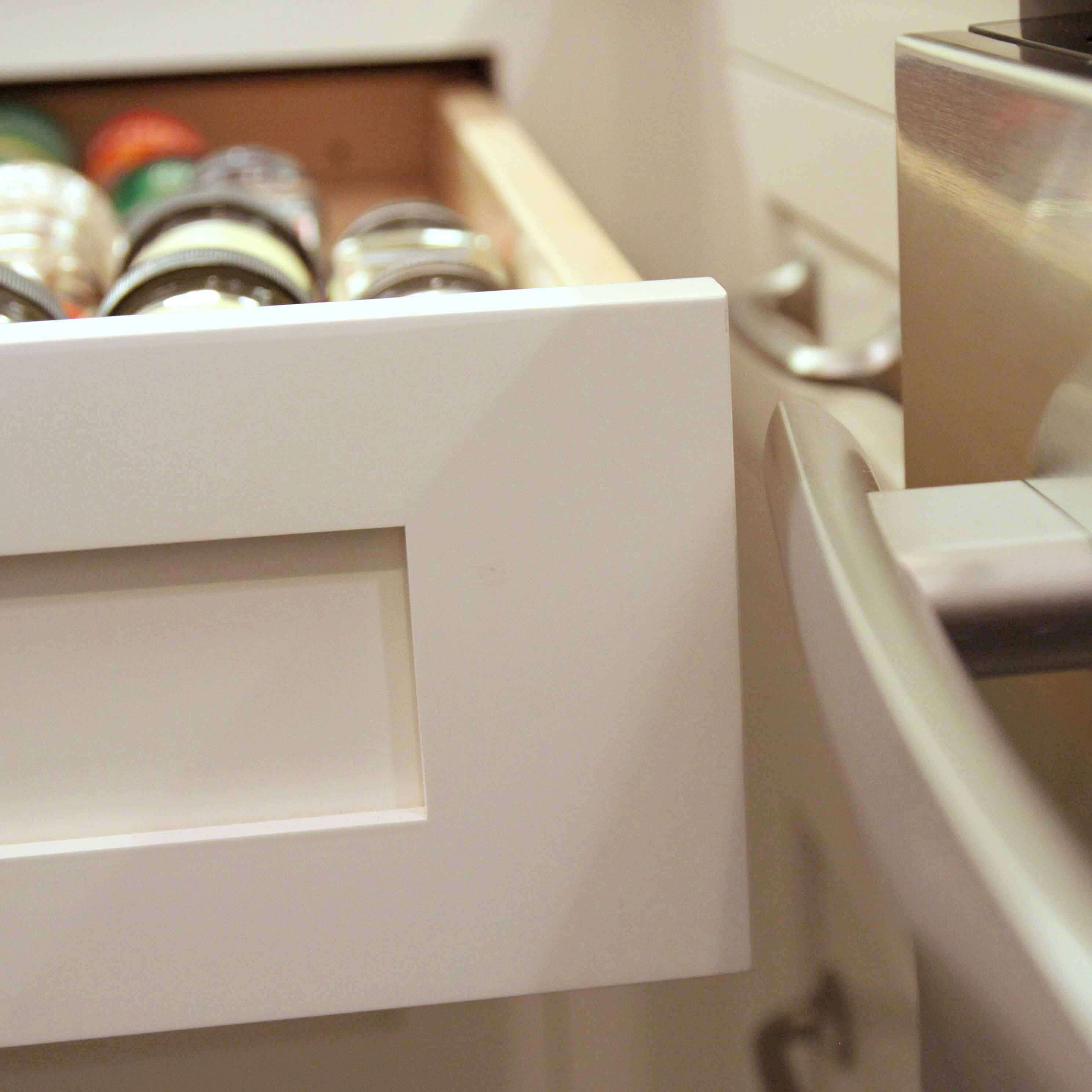
See how the drawer pulls past the handle of the appliance thanks to the extra space on the right side of the drawer.
4. Something Doesn’t Look Right, the Undertones are Clashing!
Did you know colors can have an undertone? An undertone is an underlying color that is less apparent than the primary hue, they are vitally important when pulling together a truly polished design. When you are selecting your finishes like countertops, tiles, hardware, cabinets, flooring, etc. your kitchen and designer will be a valuable asset in identifying materials and colors that coordinate beautifully with matching undertones. Properly identifying undertones is a skill that can take years to perfect, which is why consulting with a design professional can be an important step in preventing a clashing color palette.
Dura Supreme has a great digital Undertone Guide to help identify which Undertone categories each of our finishes fall under. Click here to see the guide.
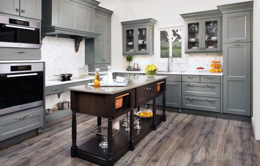
This is a great kitchen, but… something just feels off. The gray cabinetry has a green-gray paint finish but the floor has a purple-gray stain making a clashing color palette.
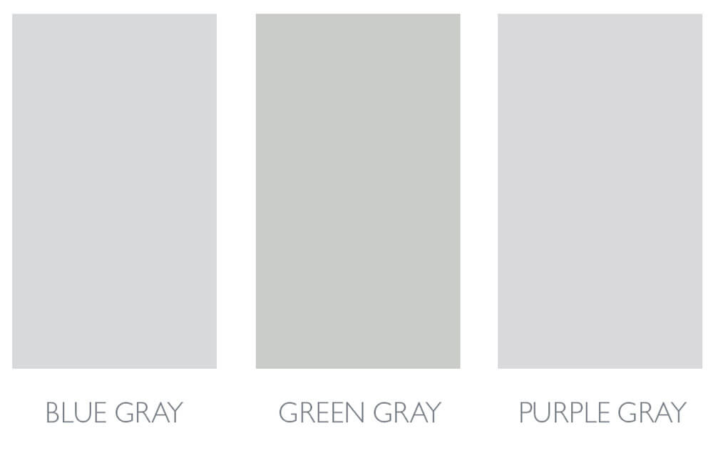
Neutrals have an undertone (a color that can be seen through the main color). For example, grays come in three kinds of undertones Blue, Green, or Purple.
5. Not Paying Attention to Architecture and Structural Elements
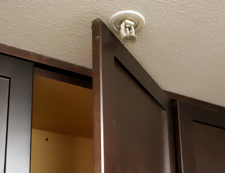
Always make sure to plan and design around the architectural details of your space. The architectural details consist of windows, doors, and trim as well as any additional details such as ceiling beams or crown molding.
When designing around doors and windows, it’s important to remember to leave space between the cabinetry and any door/window trim (or casing). At least 3″ of space between the cabinets and any trim work is ideal although this can vary depending on your space. This allows room for the wall to be painted or tiled depending on your design. Your Dura Supreme kitchen designer can work with you to determine the appropriate amount of space for your project.
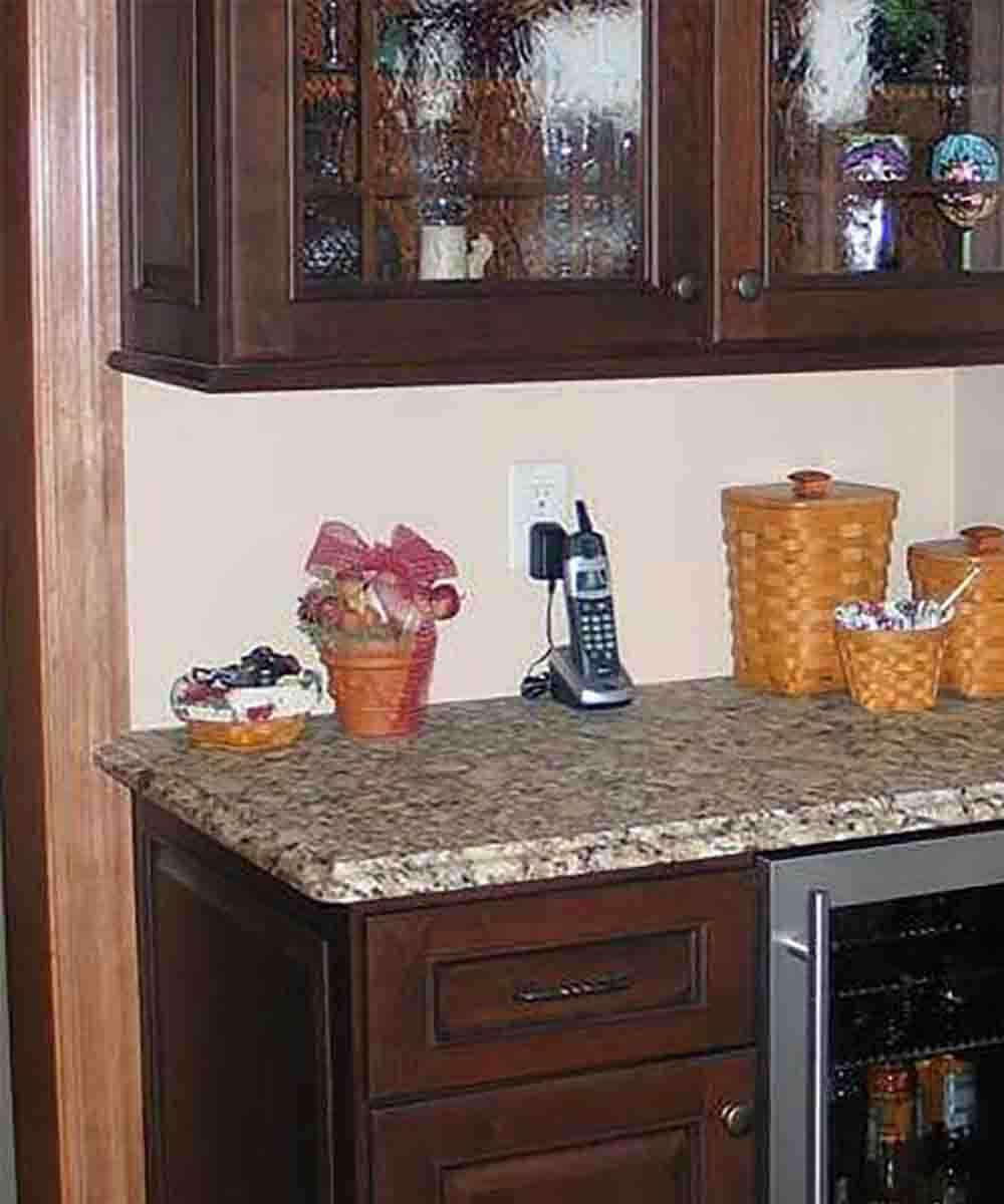
In addition to the light rail molding and the countertop extending over the door casing on the left – the countertop extends beyond the wall on the right.
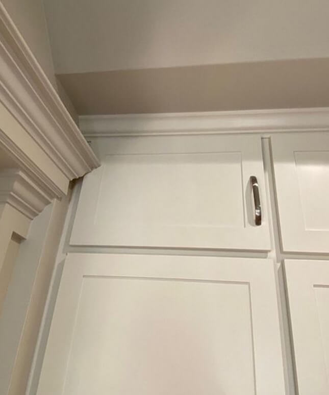
The structural molding around the door casing is so big it completely blocks the top wall cabinet from opening. Photo courtesy of @pleasehatethesethings on Instagram.
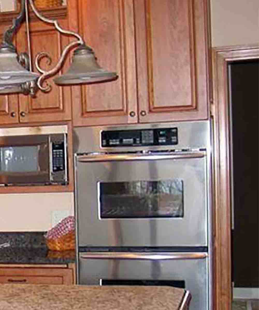
Someone forgot to consider the molding around the door in this design.
6. Oh Yeah, There’s Crown Molding On Top…
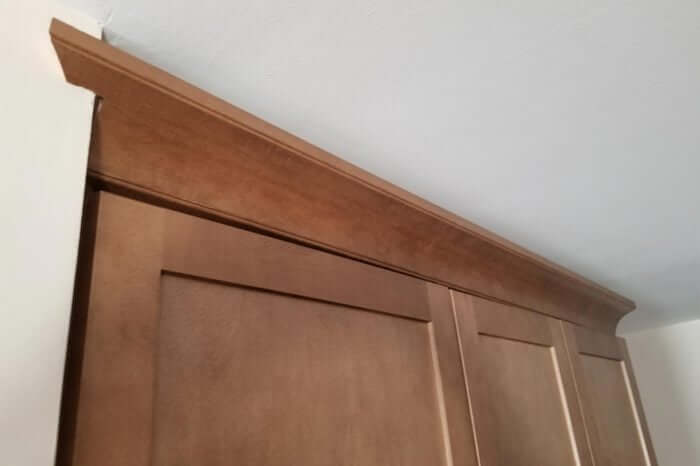
Another common mistake is forgetting to leave room for the crown molding to be installed on top of the cabinets. Not planning for the crown molding installation makes the molding look like an afterthought as illustrated in the example below.
Notice how the molding has been notched during the installation to fit the space. Photo courtesy of Renosgroup.
7. My Kitchen Island Doesn’t Fit or Function
The idea of installing a kitchen island offers the promise of additional storage and countertop space, but … choosing the wrong kitchen island and/or placing it in the wrong spot can be a disaster. Remember that the kitchen is a work area and anything that gets in the way of your working efficiently is going to be a problem and cause headaches down the road.
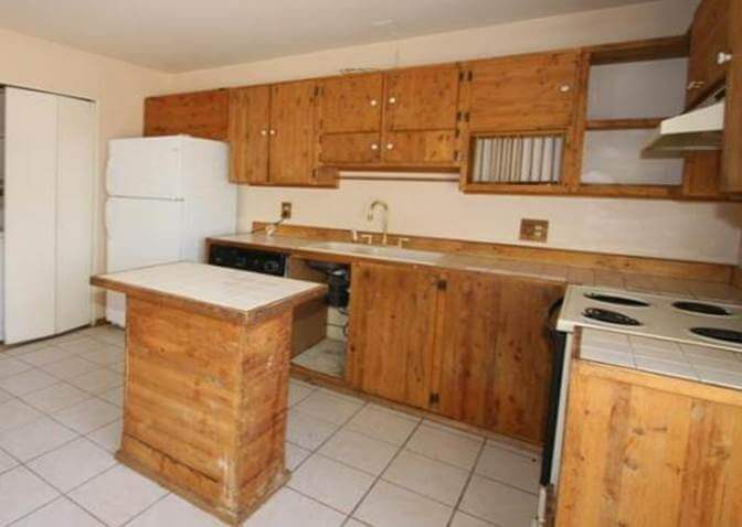
Let’s take a closer look at the example below; here we have an unusually shaped kitchen island that is just too big for the space. And that’s not all, the space between the range and the sink (hidden behind the kitchen island) is also too small making this kitchen feel cramped and difficult to work in.
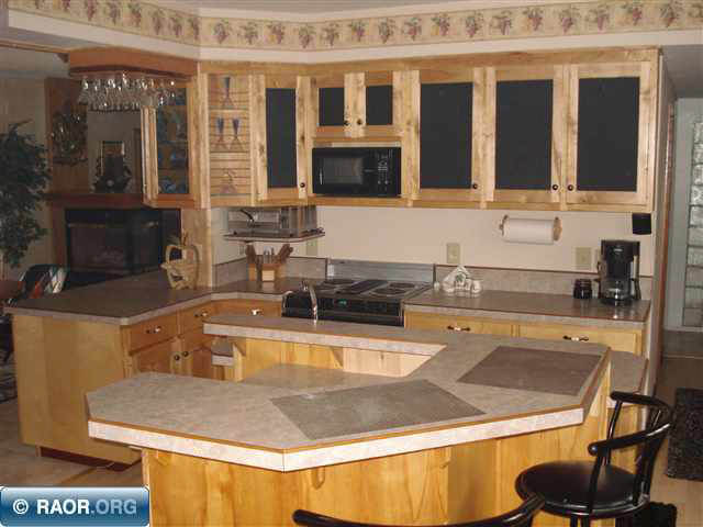
Photo courtesy of www.realtor.com.
The kitchen island should be large enough to be functional but not take over the space. Kitchen islands that are too narrow or too small will also have an impact on the overall functionality of the kitchen layouts.
8. Where did the Counter Space Go?
One of the biggest complaints homeowners have about their kitchens is the lack of countertop space. The countertop, just like the cabinetry, needs to be functional. The amount of space and where you need the space should be specified based on how you plan to use your kitchen.
The most common countertop space mistake is having an overabundance of appliances. We all have and/or want lots of fun gadgets in our new kitchen, but it’s important to consider what you lose when you add more. For example, remember that a separate cooktop with a separate oven will take up more space than one free-standing or slide-in-range.
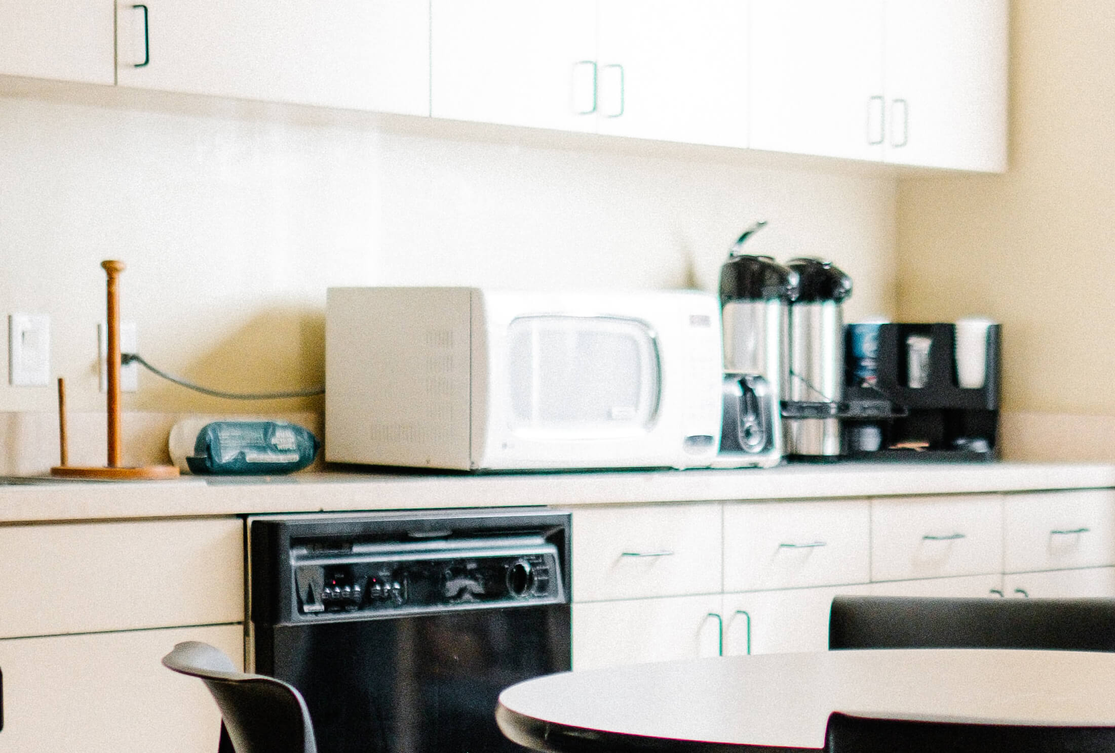
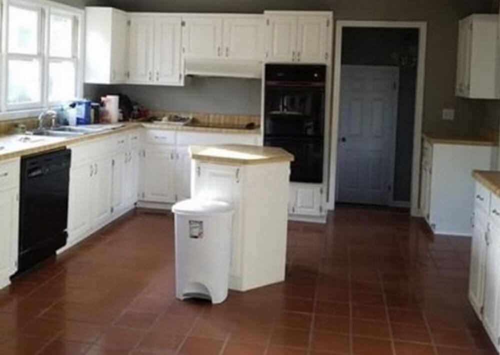
This is a nice kitchen, but the countertop is taken over by small appliances.
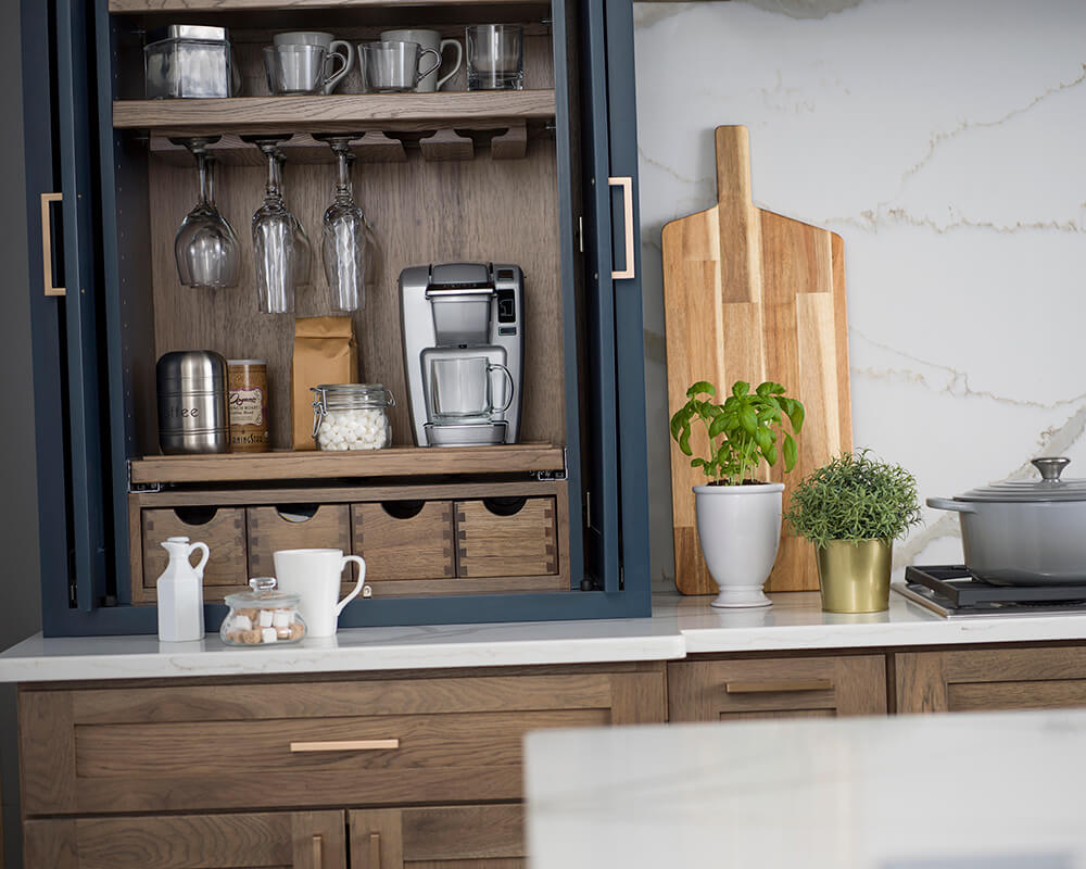
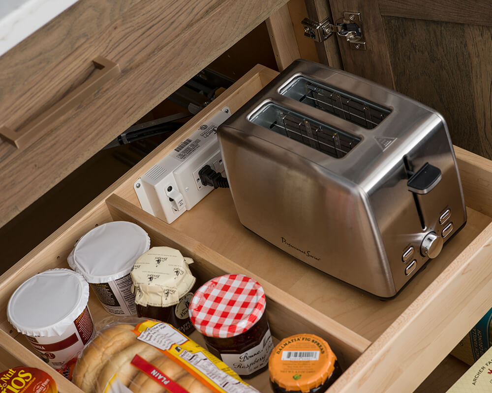
Not to mention all the small countertop appliances that we have today… toasters, coffee makers, can openers, mixers, food processors, etc. When designing a new kitchen it’s important to consider where these small appliances will be stored and used to better control appliance creep, which is the tendency for appliances to accumulate on our countertops, taking up this precious workspace. Adding storage solutions near your workspace can help keep them from taking over your counter space.
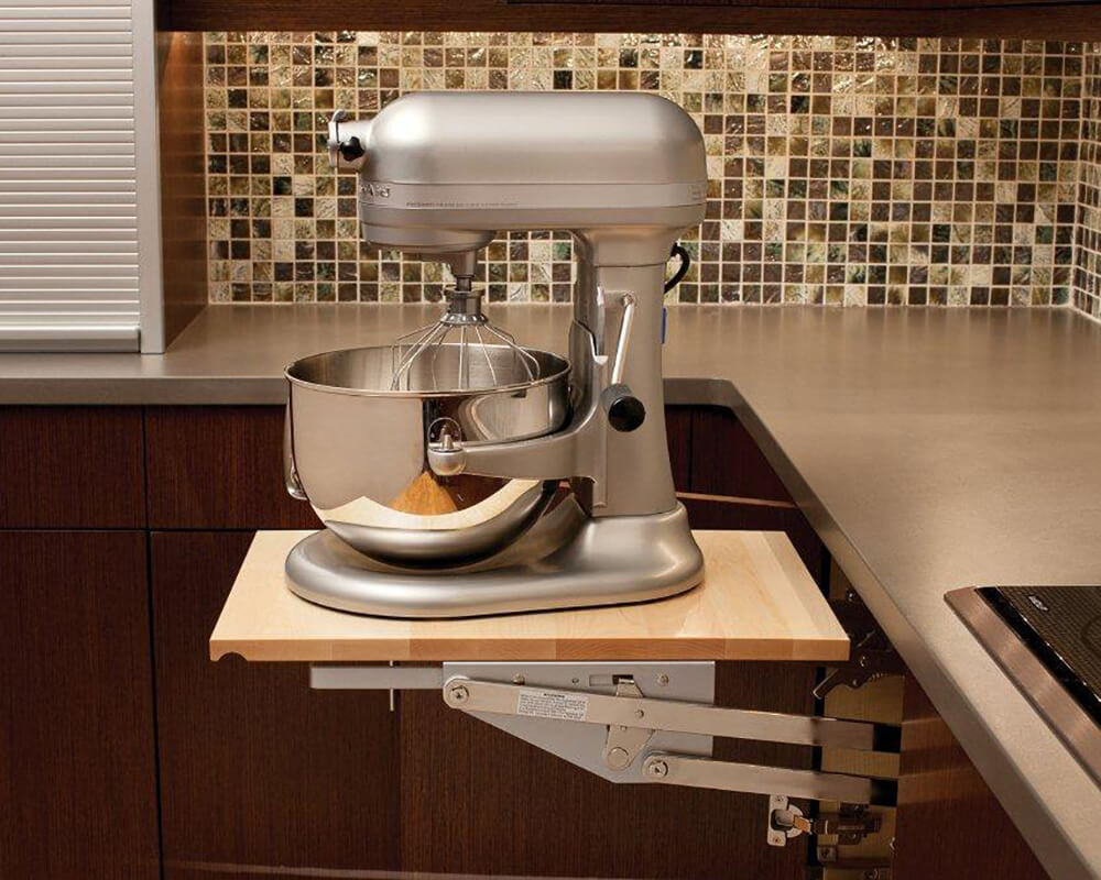
A large mixer or other heavy kitchen appliance can be lifted with ease to countertop level than conveniently stored in its own cabinet without straining your back with a Swing-Up Appliance Lift Cabinet.
9. Don’t Forget the Little Details!
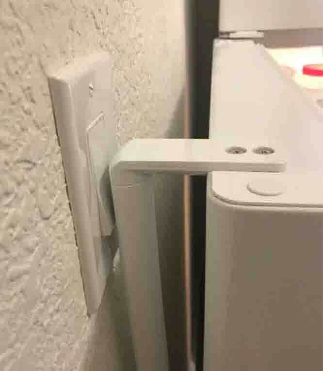
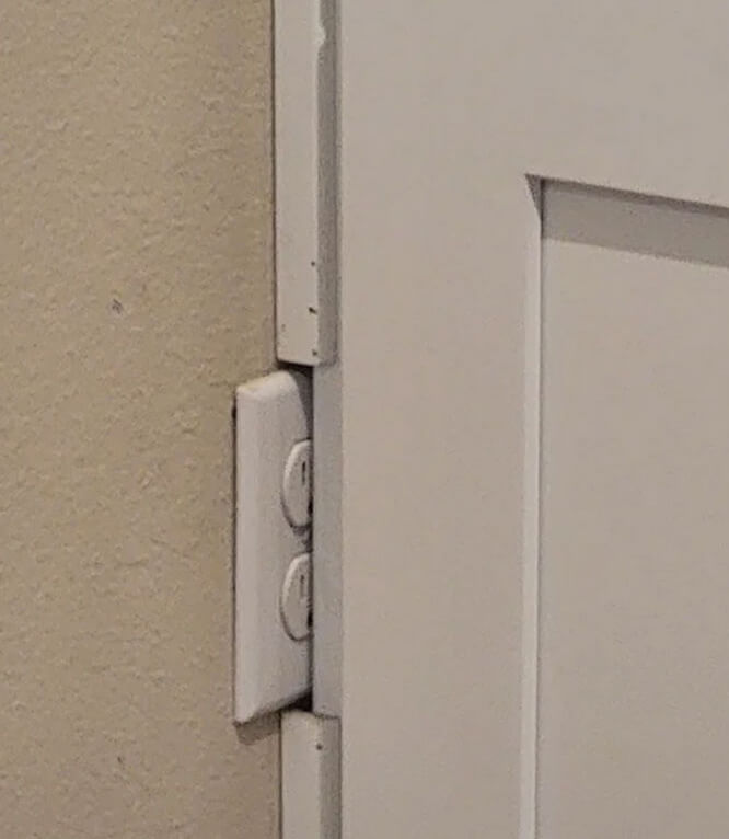
Sometimes the little things can catch you by surprise. It’s important to note where all your current and/or future outlets, switches, vents, etc. will be placed throughout the design. All light switches should be out of the way of any swinging doors, the pulling out of drawers, or other movements that could create the chance for accidental flipping of a switch. Outlets should be accessible and located in areas that will be the most convenient. High-traffic areas for small appliances and powered items should have ample nearby power sources. Vents shouldn’t be covered up or blocked.
10. I Don’t need to Hire a Professional
These kitchen design mistakes are just some of the many reasons hiring a professional kitchen designer can be vital to having a well-designed kitchen. Our Dura Supreme Cabinetry kitchen designers are highly trained experts that can help you design a kitchen that both looks and functions beautifully making the most out of your investment and ensuring you’ll have a highly-functioning space for many years to come.
Understanding these classic design mistakes and getting the guidance of a professional kitchen designer will help you know how to overcome and avoid them in your kitchen renovation.
